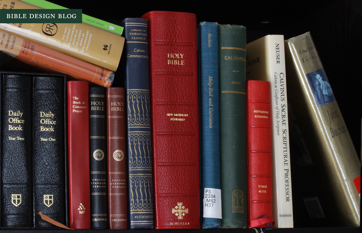
Schuyler Quentel Reference Bible (NASB) in Firebrick Red Goatskin
 The Quentel NASB, the first reference Bible in a new line from Schuyler, features a new typesetting by the Danish firm 2k/Denmark and was printed and bound in the Netherlands by Jongbloed. To make the Quentel stand out, Schuyler specified 11-point type and a luxurious 45gsm paper, two choices that make this edition roughly the size and weight of an ESV Study Bible. This is not a thinline by any means and won't charm the weight weinies out there, either. If you can manage the girth, however, the Quentel offers nice big type and vintage-style opacity. In essence Schuyler has done what a lot of Bible Design Blog readers dream of: they jettisoned the thinline chic to find out what happens when you increase type and paper thickness. If you ask me, the Quentel is a triumph.
The specs from EvangelicalBible.com look like this:
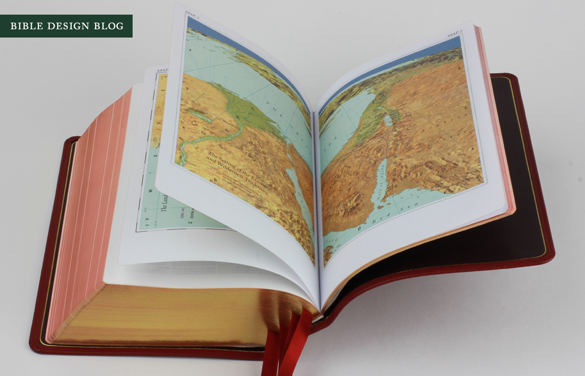
Goatskin Covers with Full Leather lining 11 point font Line Matching 45 GSM Bible Paper (most opaque in the industry) 6 x 9 trim size 16 mm margins (approx 0.65") 45mm bulk (thickness) - approx 1.5" 4 x 1cm ribbons (All Navy Blue) Art-Gilt edging (red under gold) with gilt line (gold line inside the cover) 9mm yapp Smyth Sewn Black letter text (chapter numbers, headers and page number in red) more than 95,000 entry cross references Concordance, 4,025, 20,000 Scripture references. 7 presentation pages 32 pages of extensive oxford maps
To put this new edition in context, I stacked it up with two Bibles I use just about every day, the Cambridge Clarion and the Crossway Legacy (the one in the photos was rebound by Leonard's Book Restoration). Both are single column settings. I chose the Clarion because it's the reference edition I'm most likely to recommend, and the Legacy because its footprint is the same as the Quentel's. As you can see in the photo, the Quentel is significantly thicker than both, and while it stacks up even with the Legacy in height and width, it dwarves the Clarion.

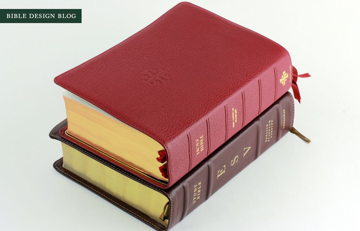
The closest match to the Quentel I could find was the ESV Study Bible (pictured above), which mirrors the Quentel in all three dimensions and weighs about the same to boot. This should give you some perspective when it comes to carrying the Quentel. If you found the ESV Study Bible to be a brick, you're going to feel the same way about the Quentel. Don't say I didn't warn you: this Bible is big.
DESIGN BY 2K/DENMARK
In October I posted a link to Andreas Krautwald's reflections on designing the Quentel. His piece offers a detailed walkthrough of the main features. While I haven't met Andreas, I had the pleasure several years ago of sitting down with Klaus Krogh and Thomas Silkjaer at the International Christian Retail Show, giving me an opportunity to gush about the Design and Production Bible showcasing the work 2k/Denmark (then 2Krogh) and Jongbloed have done together. Ever since I got my hands on that book, I've been encouraging people in Bible publishing to go the whole way and have an edition designed by 2k/Denmark and printing and bound by Jongbloed. In fact, during that same weekend at ICRS, I had this conversation with Sky Cline of EvangelicalBible.com, who was already thinking along the same lines.

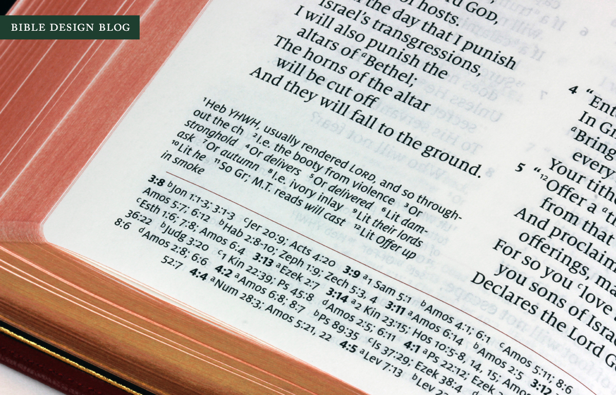
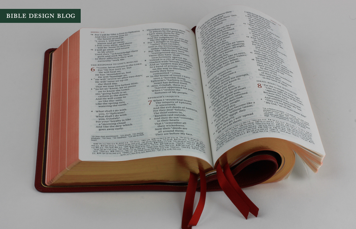
The Quentel at first glance appears to be a conventional two column text setting. It looks almost conservative. The design doesn't scream for you to look at it, but when you do, you notice several refinements. The references are placed at the bottom of the page -- textual notes at the end of the outside column, and cross-references in a single column at the foot of the page. This allows more space for the text itself, which the Quentel needs given its 11-point type.
Another refinement is the use of red ink to offset page headers and chapter numbers, and a red rule to separate the text from the references. In traditional printing, using red as an accent for aesthetic purposes was commonplace. Now we tend to associate the practice with red-letter Bibles, especially in North America where the trend got started. The Quentel's use of red lends the layout a classical elegance I find very attractive to the eye. It helps that the printing was done so superbly.


Here's another thing I've noticed about the Quentel. You know how two column text settings tend to slice-and-dice poetry sections? You end up with choppy breaks and often a word all alone on the line. Reading the poetry sections in the Quentel, I was impressed how carefully set they seemed. I'm not sure if this required special effort, or if the combination of the NASB text and the type size was serendipitous -- but as a writing professor of mine once said, if you did the work, you get credit for the result. Hopefully other Quentel readers will chime in with their experiences. To me, the poetry here looks much better than I expect a two column setting to appear.
My first real job, circa 1986, was setting type, so I've always had a special appreciation for good typography. When you set type in all-caps, the elegant thing to do is reduce the size in relation to the rest of the type, so that it doesn't shout. You can also letter-space the capitals. I can only imagine how frustrating it is for the designers who work on my novels: they receive my hand-annotated galleys with instructions like "make all-caps small-caps!" accompanied by citations from Robert Bringhurst. While I do not consider myself an expert, I can appreciate the work of those who are. The Quentel's small headers and its nicely-scaled section headings fill me with joy.
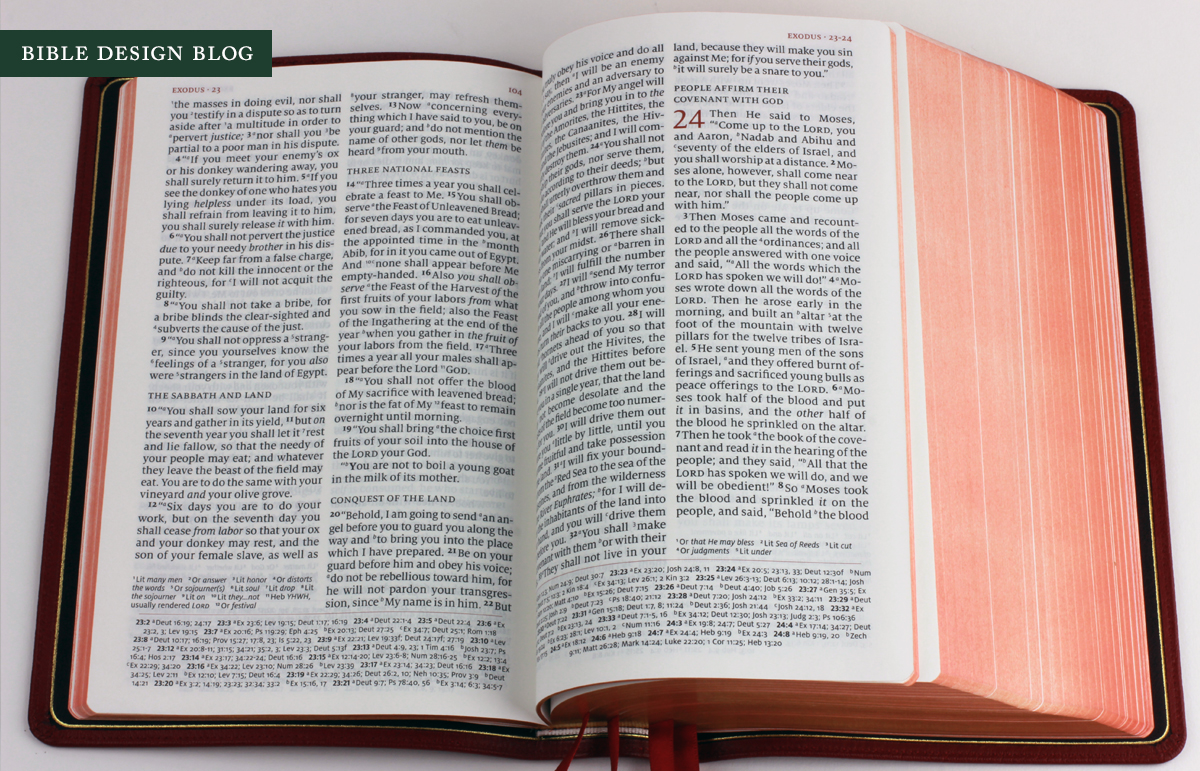
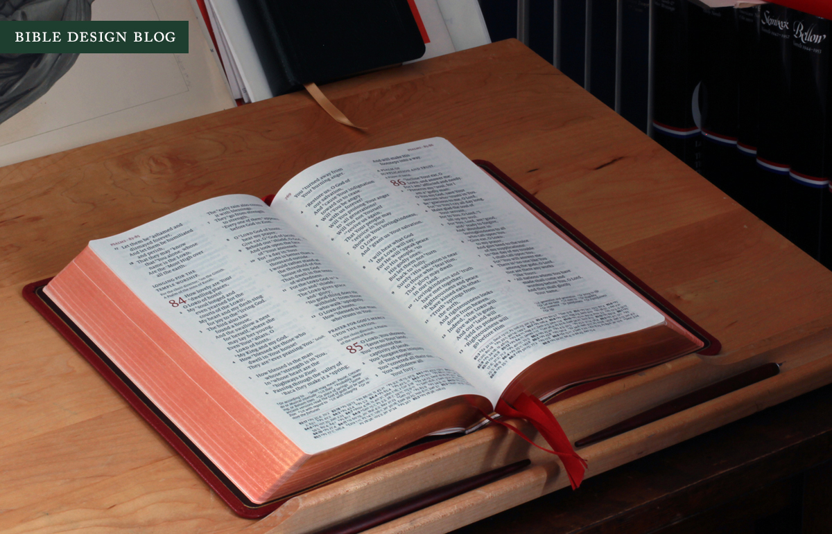
As you look at the photo above, a page spread from Exodus, you can get a feeling for just how thick the Quentel is. The edge-lined binding from Jongbloed is limp and certainly has the mechanics to open flat. But when you're near the front or back, the weight of the pages makes it a little bit tricky, and there's a heavily-reinforced tab on either side of the book, too.

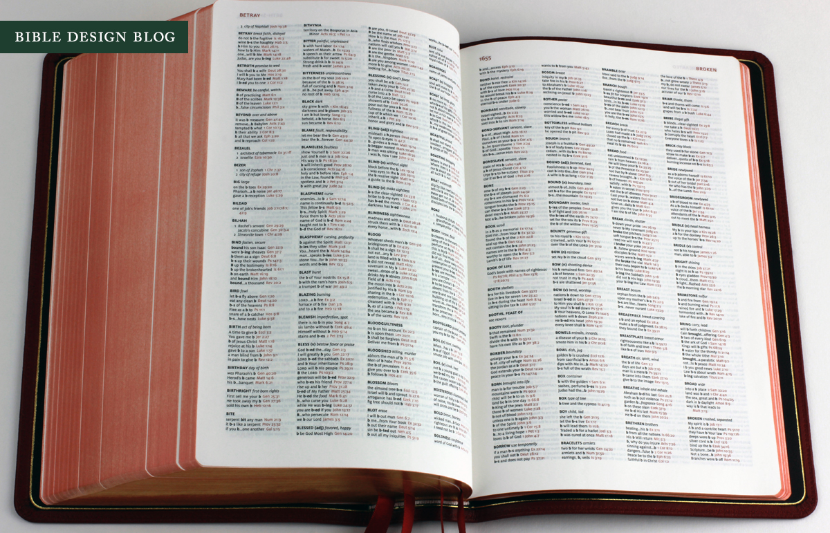
I've never rhapsodized about a concordance before, but the Quentel's concordance is simply beautiful. It would look good in a frame on the wall. Here the use of red accents, rather than traditional, comes off as very modern (in the best sense).
THE QUENTEL'S PAPER
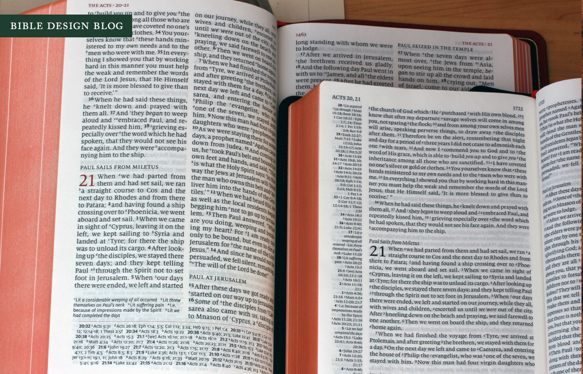
For Bible design fanatics, the Quentel's main selling point has to be the 45gsm paper. For a couple of years, publishers have been pushing the threshold on paper in response to reader concerns about opacity and "ghosting" -- that five o'clock shadow that comes from the print on the back of the page showing through to the front. My beloved Clarion's paper is 27gsm. To minimize ghosting Cambridge uses line-matching, the theory being that if the lines of print on either side of the page match, the five o'clock shadow is reduced. When the lines do match, you can see the desired effect. My Clarion, from the first edition, has a few spots where the lines are off.
The Quentel also uses line-matching while going where no man has gone before -- into the 40s, that is. Past Schuyler editions have used 32gsm paper, while the ESV Study Bible and Crossway's current Thinline, Personal Reference, and Large Print Thinline use 30gsm. The Crossway Legacy, printed in Italy by LEGO, uses 36gsm Thincoat Plus, which has proven very popular. But as far as I know, no one has broken into the 40s before. Flipping through sample books, it's always seemed to me that in the 40s is where you'd start seeing real improvements in terms of opacity. Don't expect miracles, though. Tomoe River paper, which I've written about before, is considered very thin by fountain pen enthusiasts, and it's 52gsm.
The Quentel is not free of ghosting. As you can see in the photos, show-through remains visible. However, thicker paper makes a noticeable difference. Here's a side-by-side comparison:

For the photo above, I snapped pictures of the Quentel, the Legacy, and the Clarion under the same lighting and in roughly the same position. I'm not an expert on paper, but Cambridge's Bob Groser is. He told me there's about a 2.5% difference in opacity between the Clarion's 27gsm paper and the 32gsm stock used on earlier Schuylers (which is one of Jongbloed's favorite papers for Bible printing these days, I'm told). I don't have opacity percentages for the Legacy's Thincoat Plus or the Quentel's 45gsm paper, but eyeballing the editions, I think a stair-step of several percentage points is probably right. Even 45gsm paper is still thin, so the gains are marginal -- but they are definitely visible. In some light, the contrast is stark.
[Update: Thanks to Andreas Krautwald, I can share the precise specs of the Quentel's paper. It's printed on Bolloré Primapage 45 gsm, which has an ISO opactity rating of 84%, ISO brightness of 87.5% and a bulk of 1,17 cm^3/g. From Bob Groser's numbers I know that the Clarion's Indolux 27gsm paper has an opacity rating of 79.5% and the Primabible 32gsm I mentioned above is rated at 81.5%. This gives a more accurate sense of the incremental gains I speculated on in the previous paragraph. Of course, there are a variety of factors at work in how we perceive opacity, including brightness and print impression.]
There's a trade-off, though: thickness. As you see below, the Quentel's thicker paper makes the book much thicker than either the Clarion or the Legacy. Is the extra 2.5-5% opacity worth the extra bulk? Maybe not if portability is your highest priority. If that's your goal, though, you probably aren't in the market for a Bible with 11-point type.

BINDING
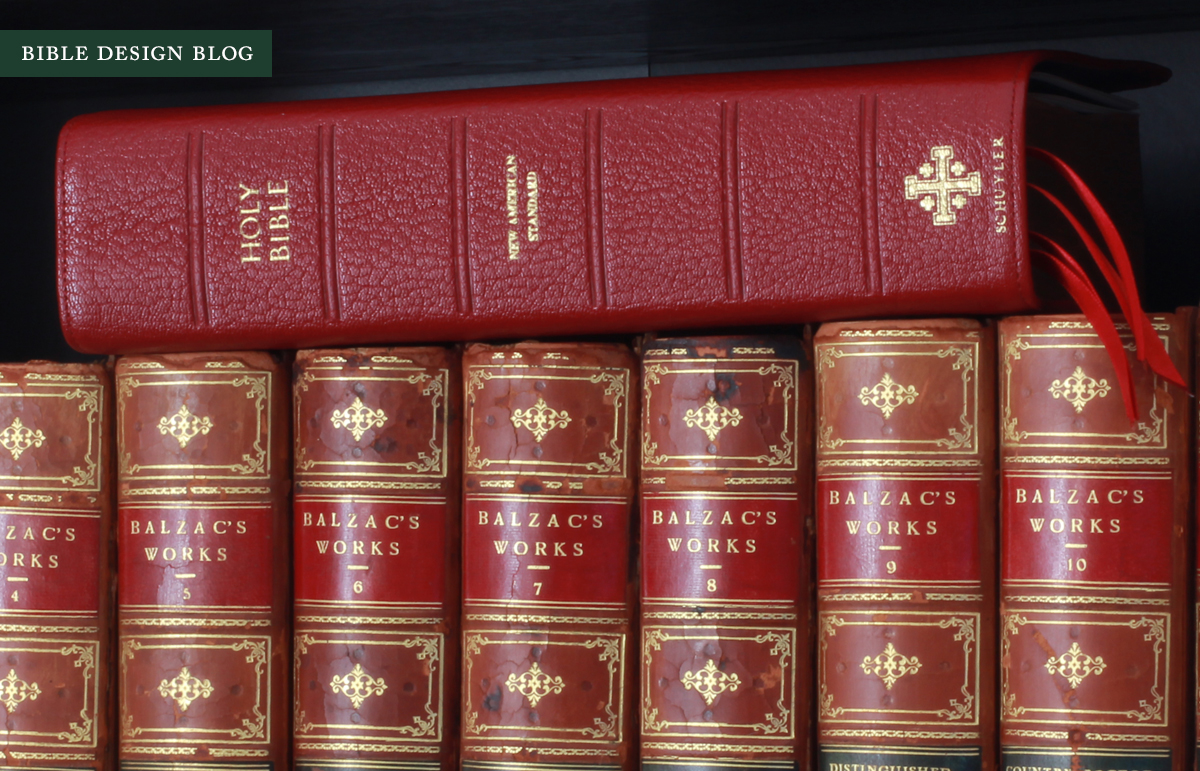
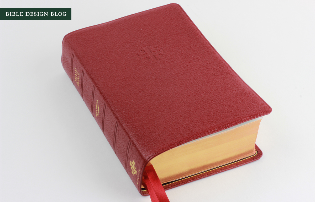
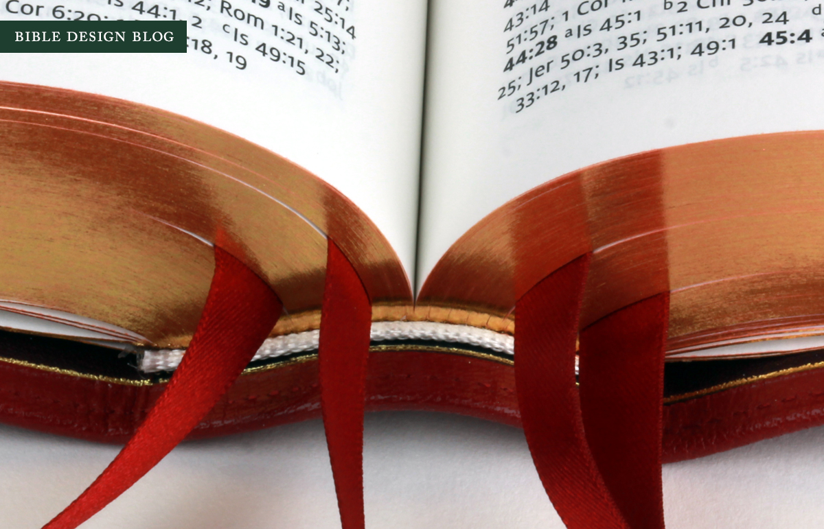
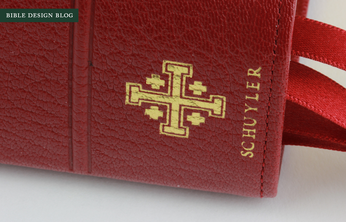
The Quentel binding features the edge-lined cover with stitching around the perimeter than Jongbloed has made its staple ever since the release of the Cambridge wide margins a number of years ago. This one is leather-lined, though -- in the case of my Firebrick Red review copy, the lining is a dark plum color. The Schuyler logo is blind embossed on the cover, with a gilded version is on the spine. The book's edges are art-gilt, and there are four thick ribbons (red in this case).


In front of the Quentel, there are several pages with a thick decorative border designed for hand inscription. The pattern is pretty wild, channeling an Arts and Crafts vibe.


While I haven't spent much time looking at Bible maps since childhood, when they got me through many a boring sermon, the ones in back of the Quentel are quite nice. If you get tired of looking at the concordance, you can brush up on Holy Land geography.
As I mentioned, the Quentel cover is strongly reinforced, which this book block probably requires. That means that while the cover is capable of limp Bible yoga moves, the hinges get in the way. When the Quentel is in your hands, you probably won't get the urge to bend it back on itself. Just to prove you could, though, I offer a little photographic proof:
FINAL THOUGHTS
The Quentel is my favorite Schuyler offering to date. I don't use the NASB much, and I prefer short-and-thick Bibles to big-and-thick ones. Having said that, I admire the Quentel for what it represents. Ever since EvangelicalBible.com began its publishing journey by launching the Schuyler imprint, they've been doing for Bible publishing what they did before for retailing: listening to the community and trying to give people what they want. The two biggest complaints I hear from average readers who get in touch via Bible Design Blog are that the print in their Bibles is too small, and the paper is not opaque enough. The reason for both problems is that publishers are betting readers prefer small and thin to big and thick, even if small and thin means too small to read and paper that's practically see-through. This is the traditional wisdom in the industry, and it's hard to swim against that tide. The Quentel does just that.
In the photograph above, you see the two best options for NASB reference editions known to me. The Clarion (right) isn't thin except in comparison to the Quentel, but it is hand-sized, about the same footprint as a small trade paperback. When the line-matching is dead-on, the 27gsm paper is a livable compromise. Some people disagree, but I grab the Clarion more than any other reference edition ... and I have a few to choose from. If you go with the Clarion NASB, you get a well-designed, relatively small, handy Bible printed and bound by Jongbloed. Assuming the level of show-through is acceptable to you, and the type isn't too small for your eyes, you're good to go.
The Quentel is also well-designed and printed and bound by Jongbloed, but it bumps the type size and the opacity up considerably. If you struggle with smaller type or find your sensitivity to five o'clock shadows growing, I think you're going to love the Quentel.
One of the hardest decisions for me was choosing which color Quentel to review. The Firebrick Red is a great color, quite vibrant in certain light, and in others more subdued. An elegant scarlet color with a hint of a purple undertone. It's also available in black, dark brown, and imperial blue. The blue tempted me, but just a leopard doesn't change its spots, my hardwired preference for red (or, when available, tan) won out. There's something beautiful about that shade. Perhaps I should have been a cardinal instead of a writer. Too late now.

For more information about the Quentel Series, including Schuyler's plans for future releases of other translations, be sure to check out the Schuyler Bibles site. The ESV, NKJV, and KJV are all slated for Quentel treatment, meaning the Quentel will be Schuyler's first "standard" edition. I'm happy to see them taking this approach, which is similar to what Cambridge has been doing with the Clarion, the Pitt Minion, and the Wide Margin. It's always frustrating to see a format you like and discover it's unavailable in the translation you need.