R. L. Allan New Living Translation in Green Highland Goatskin (NLT1G)
 OVERVIEW
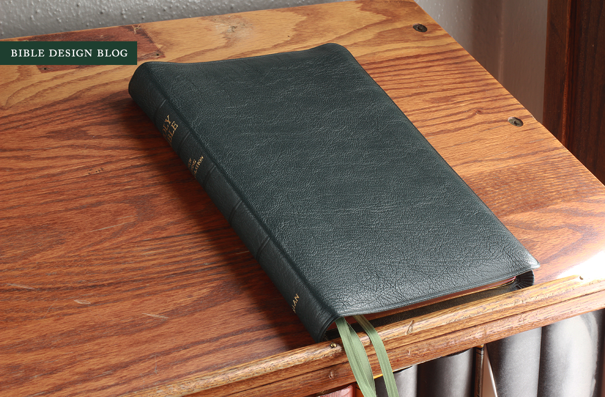
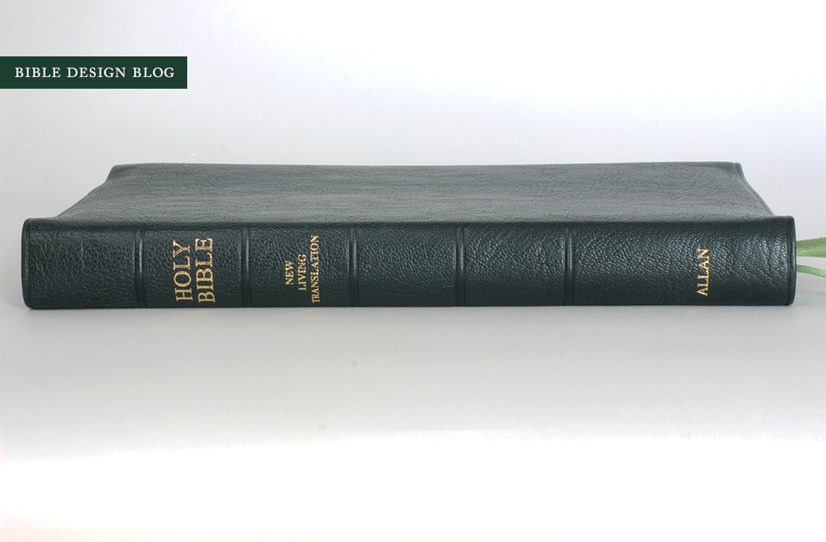
Green with envy. That's how more than a few people feel after the green highland goatskin edition of R. L. Allan's NLT1 sold out, though they're still available on the secondhand market. The NLT1 begins with one of Tyndale's Premium Slimline Reference book blocks (printed in China), then adds an exquisite highland goat binding, three ribbons, art-gilt edges and some lovely maps. The Bible pictured here is bound in green goatskin -- not the first green Bible from R. L. Allan, but clearly the best green they've done. Perhaps the best green anyone has done, to be honest. The box just says "green," but the Allan site calls it "Brunswick Green." Brunswick must be British for awesome. And it kind of matches the Bible Design Blog logo.
I don't use the New Living Translation too often ... but this binding makes me wish I did.
DESIGN NOTES & PAPER
For those of you who don't know already, the R. L. Allan business model breaks down to this: source some pre-existing book blocks from a publisher and have them specially hand bound in London in a variety of beautiful leathers. Sometimes they have a greater say in the book block's quality, but usually it's the binding that makes an Allan Bible so desirable. The bindings are so consistently good that, if there's a chink in the armor, it is almost always the book block. So let's start there.
The book block is 6.5" x 9.25" x 0.85" (give or take), which is big enough, then the semi-yapp cover bumps the dimensions up to roughly 7" x 10". A large, skinny book block like this is a great choice for pairing with an edge-lined Allan binding. The floppiness of the block complements the limpness of the cover like you wouldn't believe. You know those movies where, to challenge someone to a duel, they slap his face with a pair of leather gloves? This is the Bible equivalent: limp and snappy, liquid in the hand, and perfect for slapping someone upside the head (if that wasn't a sin).

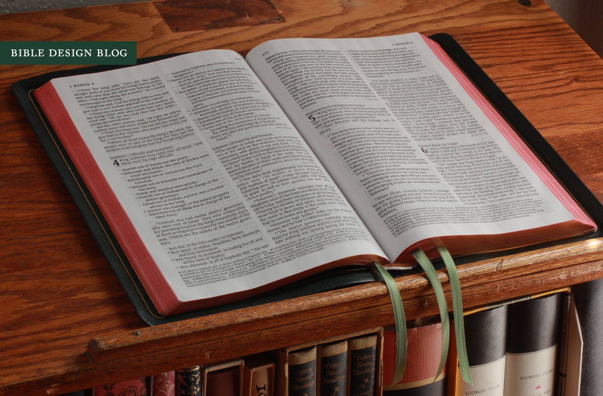
The layout is a typical double column design, with each column just over 2.5" thick. The type is 10 pt. in size, utterly readable. Thanks to the NLT translators, this Bible does something I wish more modern translations did: dialogue is formatted correctly, with a new paragraph for each new speaker. (You're not translating into modern English if you're not doing this, people. I'm sorry, but you're not.) Allan is calling this a Readers Edition, and while I don't think a double column reference Bible with verse numbers in the text can really qualify as a design oriented toward readers, it is imminently readable by traditional standards.
One quirk of the format, by the way, is that despite being billed as a reference edition, you won't find a column of cross-references on the page. Instead, the references are listed within the text column itself, set apart by the font. So, for example, at the end of Genesis 1.1-2 you'll find "John 1.1-2" listed on the same line. Several examples can be seen in the photos. I find this a little clumsy at times, but you get used to it.

Line matching in my copy is inconsistent, which means some spreads manifest more show-through than others. On the pages where the text lines up, I don't notice the five o'clock shadow any more than I do in most Bibles. On the mismatched pages, though, I find the grey cast distracting. Inevitably someone will chime in and declare, "For a Bible that costs this much, there should be no ghosting at all!" I understand that when we spend our hard-earned money, we have an expectation of exceptional quality, if not perfection. If you struggle with the presence of imperfections in high end editions, you should probably take a pass on this one. The book block isn't in the same league as the binding.
Having said that, if you're an NLT reader, you're already accustomed to the book block (or ones like it from Tyndale) and the selling point here is getting to have your favorite translation in an exceptional Allan binding. If that's you, the NLT1 will not disappoint. This one's head and shoulders above the dearly departed Tyndale Select.
One more note on the book block before we talk about the binding: as the photo below illustrates, this is a red-letter edition. Bible Design Blog readers will have picked up by now that I'm not a fan of red letters. It's a Victorian-era practice that to me amounts to tampering with the text, creating the false impression that some words are more inspired than others. A secondary objection is that red lettering is often done poorly, rendering the words of Christ in semi-readable pink. (I don't lead with that gripe because it's pragmatic, akin to opposing torture because it's an ineffective way of obtaining information. Oppose it because it's evil instead. Torture, I mean, not red letters.)
The NLT1, sadly, suffers from the pinkish-red syndrome. It's not terrible -- I've seen much worse -- but I really wish the printer had managed to get a darker shade on the page. Decide for yourself:

BINDING
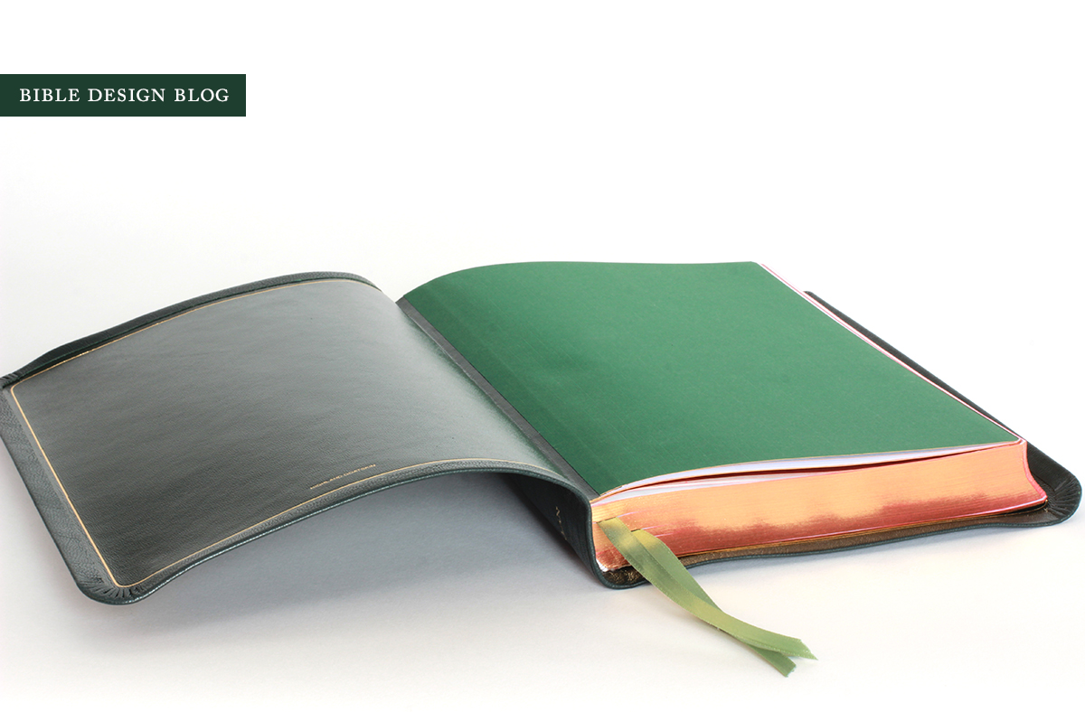
R. L. Allan has just about made luxury bindings boring by doing them so consistently well. Just about, but not quite. I haven't seen the black or brown editions in person, but the green has genuine verve. Everything you expect from an Allan binding is here: the limp, semi-yapp cover, three ribbons (in this case light green for contrast), art-gilt pages, and the signature white headband. The endpapers are a brighter green than the cover -- a flashier lining behind the conservative surface.

Conservative, you ask? How can a green cover ever be described as conservative, a label surely reserved for black? Well, for one thing, the NLT is a descendent of the original Living Bible, and I once experienced existential heartbreak by discovering a beautiful dark green Living Bible in a used bookstore right after blowing my Bible-buying budget for the month. To me, green is the most fitting color you could cloth this translation in. Plus, this is dark green. It's not as dark as a pair of Charleston, South Carolina shutters, but in the right light it could almost pass for black. It's the green of a classy leather club chair in an exclusive establishment that would admit neither of us.
Ian Metcalfe, head of R. L. Allan, mentioned on Facebook that they'd found some surplus green goatskin and wondered what to do with it. Fortunately I was the first to comment. I told him to bind a run of Crossway Legacy book blocks in it. Since everyone knows the first commenter always wins, I feel confident this will happen in the near future.

The Allan binding is the sine qua non. It's the binding Bible yoga was made for. Literally. Trying to figure out how to convey the limpness of an Allan binding in static photos, I came up with the idea of twisting it up for the camera. As I said, tall skinny book blocks like this are the absolutely best when it comes to showing off what the cover can do. Things like this are no surprise:

And neither are things like this:

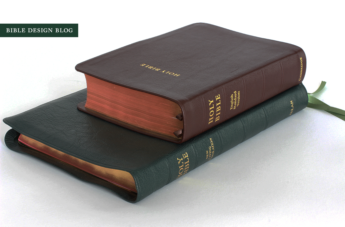
COMPARISONS
Tall and skinny comes with some downsides, though. No matter how slender this Bible is, the NLT1 remains ... big. To see just how big, I did a comparison to my trusty Cambridge Wide Margin. The Cambridge has a large footprint, but as you can see, it's shorter than the NLT1 and only a half inch or so wider. The thinness of the NLT1 belies its bulk. Don't mistake it for a compact Bible, though. This one takes up a lot of room, especially when it's open.

Still, if my ideal for single column Bibles is "short and stout," I think the NLT1's tall and slim silhouette represents another ideal, albeit an antithetical one. So let's compare it with the Cambridge Clarion, one of the best exemplars of my ideal single column form factor until something shorter and stouter comes along. As you can see, the NLT1 dwarfs the Clarion in every dimension other than girth:
CONCLUSIONS
Let's be honest: if the NLT is your primary translation, this is a no-brainer. You need one of these. If you can't find the green one secondhand or don't want to spring for aftermarket prices, the black and the brown will both serve you well. This would make a particularly fine Bible for the pulpit, too. I couldn't help cleaning off my lectern (well, one of my lecterns) and opening it up. I'll leave you with a vision of what the NLT1 looks like in action.