Schuyler NKJV Single Column in Natural Grain Goatskin (Red and Brown)
 A new single column setting of Scripture is always worth getting excited about. Back in 2009 when Thomas Nelson first teased us with this layout of the NKJV, there was even more reason: single column editions were pretty rare compared to today. When, a few years later, the newly launched Schuyler imprint announced they would be using the Nelson setting in one of their own editions, fans of the NKJV had even more reason to rejoice.
Somehow I missed out on the first printing of Schuyler NKJV Single Columns -- but Beth Rhodes didn't, and she posted a thorough write-up back in October. To make a long story short, she liked it, though she did note that the uneven line-matching could be frustrating.
A new single column setting of Scripture is always worth getting excited about. Back in 2009 when Thomas Nelson first teased us with this layout of the NKJV, there was even more reason: single column editions were pretty rare compared to today. When, a few years later, the newly launched Schuyler imprint announced they would be using the Nelson setting in one of their own editions, fans of the NKJV had even more reason to rejoice.
Somehow I missed out on the first printing of Schuyler NKJV Single Columns -- but Beth Rhodes didn't, and she posted a thorough write-up back in October. To make a long story short, she liked it, though she did note that the uneven line-matching could be frustrating.
With a few aesthetic tweaks and a fresh selection of colors, the Schuyler NKJV Single Column is back. The question is whether it's better the second time around. Let's find out.
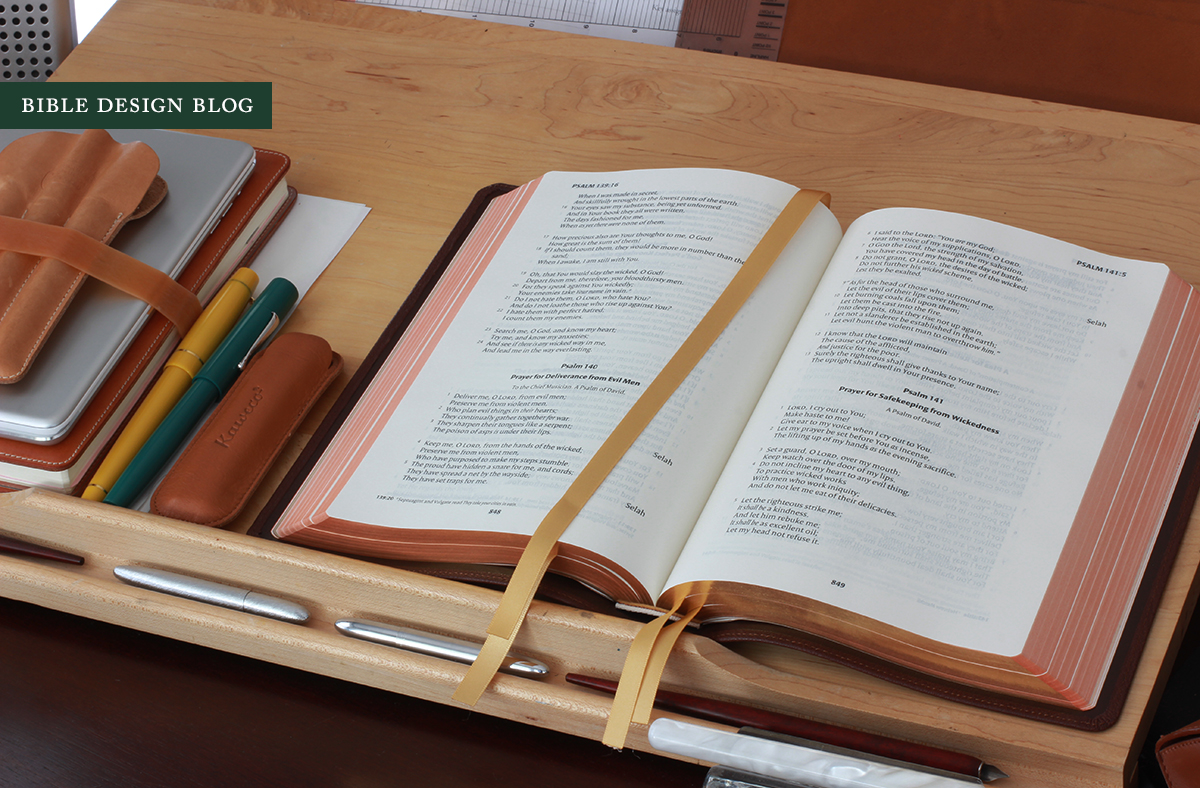

THE SECOND PRINTING When I stepped inside the headquarters of EvangelicalBible.com in Virginia, one of the first things I noticed was the stack of boxes lining the main hallway, each one packed with newly-arrived copies of the Schuyler NKJV Single Column. They were hard to miss. Even harder was not tearing into them when nobody was looking. I suppressed the impulse and was eventually rewarded with a firsthand look. When I left later that day, I took a couple of review copies with me, the red and the brown.
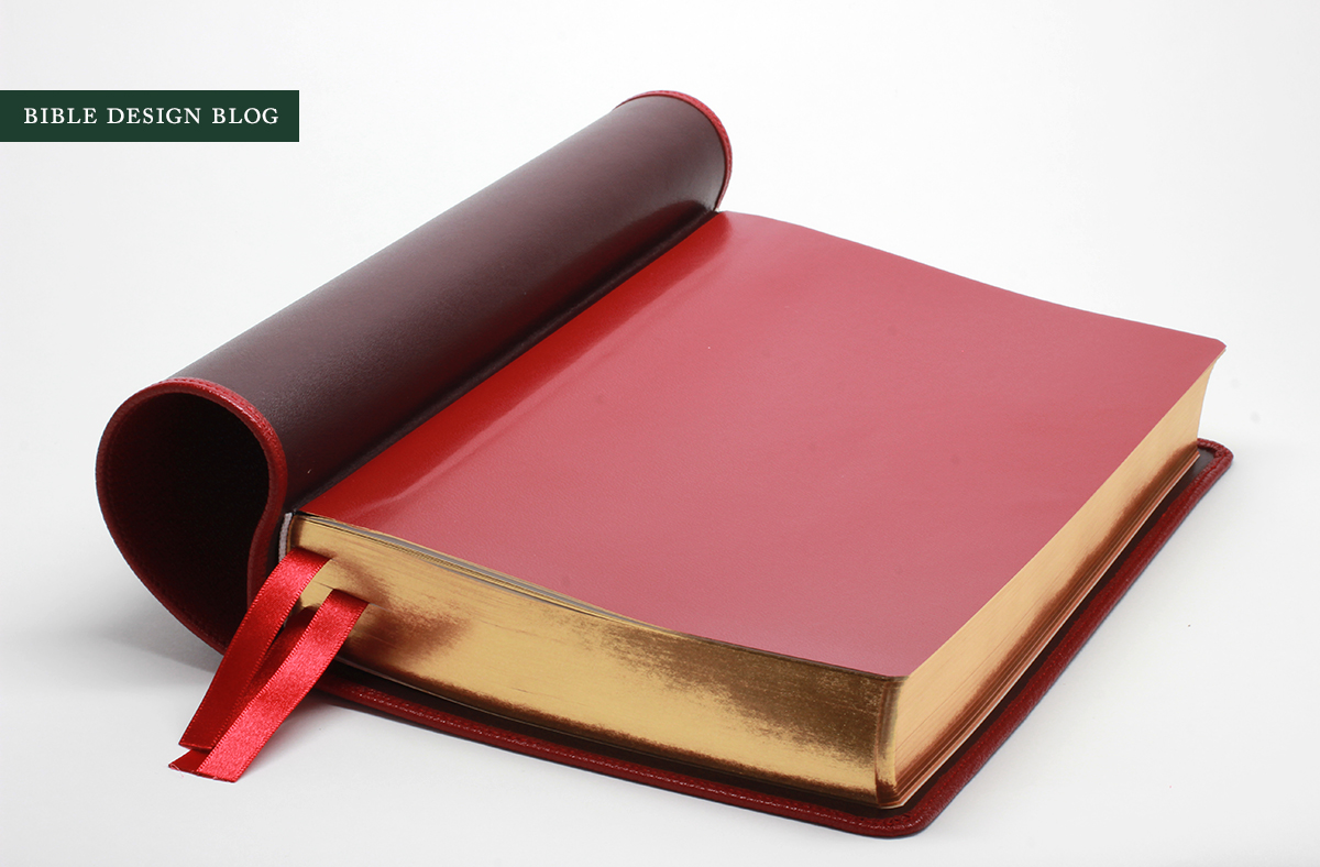
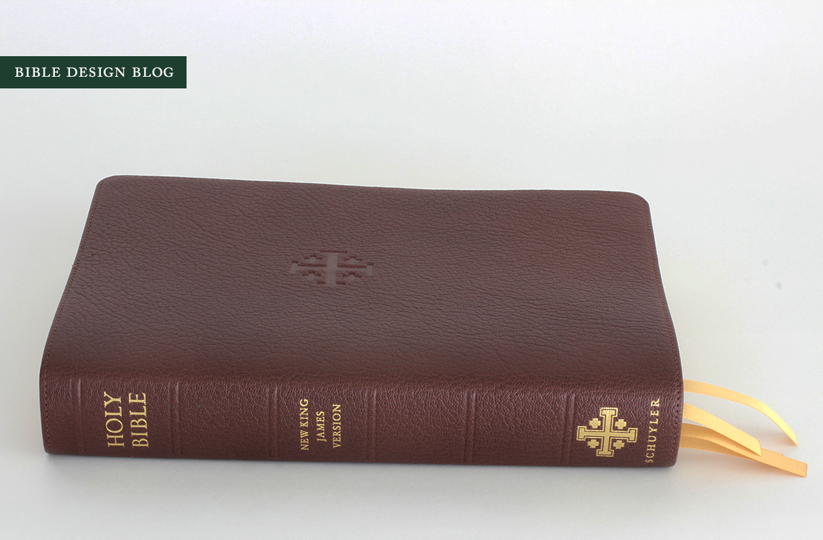
The second printing of Schuyler's NKJV Single Column is available in four colors: Black, Brown Marble, Imperial Blue, and Firebrick Red. The Bibles are printed on 32 gsm paper, and have Smyth-sewn book blocks. They're bound in edge-lined Cantara goatskin covers with full leather linings, hand-stitched around the perimeter for reinforcement. In a subtle refinement, the front cover features a blind emboss of the Schuyler cross --without the big HOLY BIBLE and NKJV in gold gilt from the first printing. Less bling results in more class. Each book includes four thick ribbon markers, too, and has art-gilt edges (red-under-gold with the exception of the Imperial Blue edition, which has blue-under-silver gilding). Some quick work with the ruler yields a trim size of roughly 6.5" x 9.5" x 1.25", which is a fairly handy proportion for a full-size Bible. The type size is 10.5 point, and the print is nice and dark. As is the case with all Schuyler Bibles, the NKJV Single Column is printed and bound in the Netherlands by Jongbloed, and the quality is first rate. They retail for just under $200, and are available exclusively at EvangelicalBible.com. (Follow the link for full specs.)


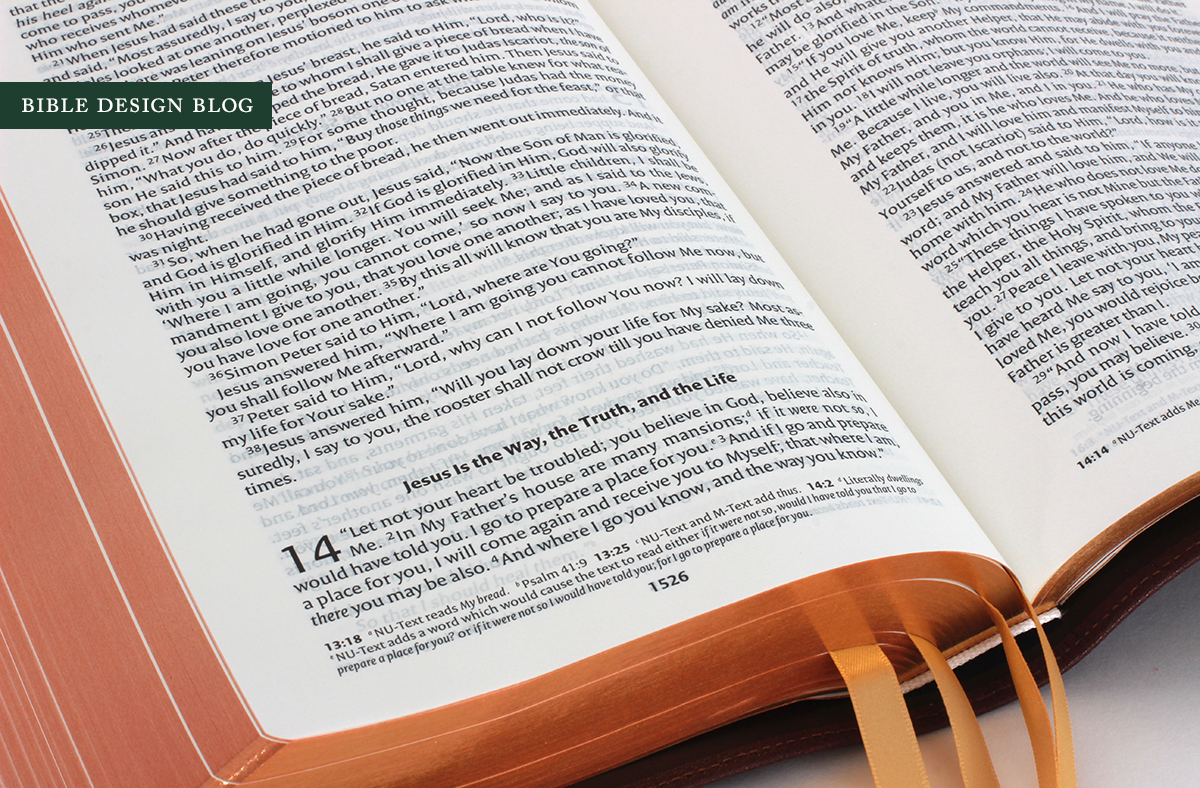
LINE-MATCHING Unfortunately, the uneven line-matching Beth noticed in the first printing is still a problem in the second. Some pages are fine and others are almost perfectly mismatched, giving the page a five o'clock shadow that takes readability down a notch. While line-matching is well outside my area of expertise, I noticed something interesting while comparing good matches to bad. Even on pages with very poor matching, the page numbers are matched precisely. For example, pages 1615/1616 (1 Corinthians 14.16-15.32) in both of my review copies are mismatched identically, but both have perfectly aligned page numbers. The fact that the line matching is consistent between copies, and the numbers themselves are matched suggests that the problem is with the text setting. In other words, it wasn't designed so that the front and back of each page would line up. There's no way to make them. This is a shame, because in every other respect the NKJV Single Column is an admirable edition.
MAKING PEACE WITH THE FONT I have to admit, the first time I encountered the typeface used in this text setting, I wasn't a fan. When it comes to fonts, I prefer old style, or humanist, typefaces for books. (If in doubt, Wikipedia is your friend.) To my eyes, they just look right. This text setting uses a font that makes me think of a beefier version of New Age, the face the TNIV used to be set in. Remember how cross-eyed and apoplectic I used to get over that font? Well, I've mellowed with age. I'm not sure whether there's a connection to New Age or not, but I've made peace with this type, telling myself there's a something Eric Gill-like about it. There's a hint of the reed pen of some Alexandrian scribe in there, and that's just fine.
PARAGRAPHED RIGHT One thing I don't have to make peace with is the paragraphing, which is done just right. The preface notes that "prose is divided into paragraphs to indicate the structure of thought," but let's face it, not all paragraphing is equal. One of my gripes with certain popular translations (I'm looking at you, ESV!) is that while they're paragraphed, they aren't paragraphed the way we actually write in English, particularly where dialogue is concerned. Open a novel at random and you'll discover that generally we begin a new paragraph whenever a new speaker chimes in. Burying a back-and-forth conversation in one long paragraph? That's not how it's done.
So I was delighted to find that this NKJV gets it right. Look at the conversation between Jesus and Peter at the end of John 13, verses 36-38. In the ESV you get this:
Simon Peter said to him, “Lord, where are you going?” Jesus answered him, “Where I am going you cannot follow me now, but you will follow afterward.” Peter said to him, “Lord, why can I not follow you now? I will lay down my life for you.” Jesus answered, “Will you lay down your life for me? Truly, truly, I say to you, the rooster will not crow till you have denied me three times.
In the paragraphed NKJV, you get this:
Simon Peter said to Him, “Lord, where are You going?” Jesus answered him, “Where I am going you cannot follow Me now, but you shall follow Me afterward.” Peter said to Him, “Lord, why can I not follow You now? I will lay down my life for Your sake.” Jesus answered him, “Will you lay down your life for My sake? Most assuredly, I say to you, the rooster shall not crow till you have denied Me three times.
It's hard to believe I never noticed this before. "It must be unique to this text setting," I told myself, but I was wrong. My NKJV Pitt Minion is like this, and so are some others I checked. Funny the stuff you miss. Since the paragraphing was done after the translation, the dialogue tags are still clunky. Ideally the work should be done hand-in-hand, or the paragraphers should be given liberty to make the necessary adjustments, like so:
“Lord, where are You going?” Simon Peter asked.
Jesus answered, “Where I am going you cannot follow Me now, but you shall follow Me afterward.”
“Lord, why can I not follow You now?" Peter asked. "I will lay down my life for Your sake.”
“Will you lay down your life for My sake?" Jesus answered. "Most assuredly, I say to you, the rooster shall not crow till you have denied Me three times.
And yes, while the NKJV's formatted beats the ESV here, it loses points in my book for all those capitalized divine pronouns -- but that's an argument for another day.
PAPER The original Schuyler editions used 32 gsm paper, and then they began to experiment with thicker stock, going all the way up to 45 gsm for the NASB Quentel. On pages where the line matching is off, the NKJV Single Column will have you yearning for thicker paper -- but when it's on, you see that 32 gsm isn't bad, all things considered. Unless you go to multiple volumes like Bibliotheca, you'll never get rid of ghosting or show through. Some papers seem better than others, and the black paper trick can be surprisingly effective, but at the end of the day Bible paper has to be ridiculously thin to accommodate so much text and so many pages. There will always be tradeoffs.

BINDING As far as color options go, you'll remember the Firebrick Red from my review of the NASB Quentel. The shade is spot-on, a bold, beautiful scarlet that doesn't veer into orange or purple. I wish I could say it's my favorite, but the fact is, I'm really smitten with the Brown Marble. The dark-to-light color variation is incredibly subtle. From a few feet away in most light, it'll be mistaken for solid. But up close in the right light, the depth comes through, making this an interesting but not flashy cover. The elegance is understated, as it should be.


Jongbloed works wonders with these edge-lined Bibles, producing limp bindings with a consistent quality that is almost boring (in the best possible sense). The only thing I would change is the stiff hinge running down either side of the spine, which keeps the Bible from opening perfectly flat. I've noted these hinges before in my reviews of the Quentel and Crossway's Heirloom Thinline (where the thinner book block makes the problem more pronounced). While I'm sure the hinge material's stiffness contributes to the strength of the binding, I wish they would find a similarly tough but more flexible alternative. These covers beg to open flat on the table, but the hinges produce tell-tale humps on either side of the spine.
OVERALL ASSESSMENT One of the things my visit to EvangelicalBible.com and Schuyler really brought home to me is how tightly connected the customer service experience of the former is connected to the publishing program of the latter. A lot of frustrated NKJV readers let their feelings be known, prompting Schuyler to negotiate rights to the Nelson text setting and produce a high quality limited run. The first outing was so successful that it led to this reprint. It goes to show that this short run, high quality publishing model is an effective way to serve the readers of translations that don't enjoy as much support as their fans could wish.
If you love the NKJV and you missed out on the first printing, then I suppose it's a no-brainer. You'll want one of these. The single column setting and relatively large print makes for a readable combination, especially when the line matching doesn't get in the way. If you already have one of the first editions, is it worth an upgrade? The only grounds would be aesthetic. If you prefer the color (likely) or the more subtle imprinting (very likely), it might be worth taking the plunge.