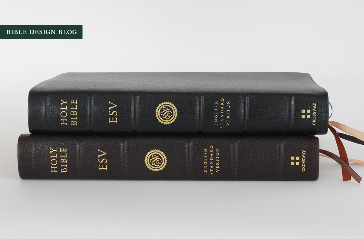
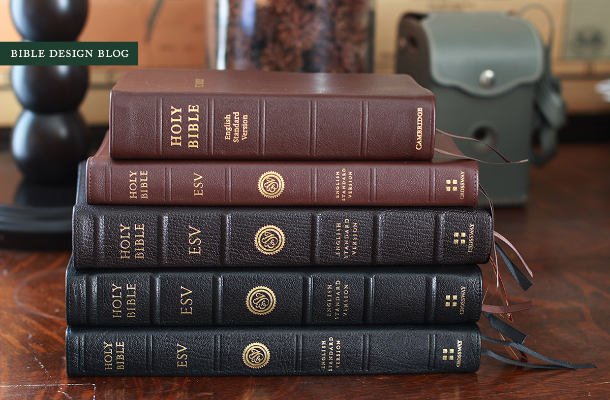
Crossway Heirloom Legacy ESV in Black and Deep Brown Goatskin
 The 2012 publication of the Legacy ESV marked a new era, a sea change, an insert-your-favorite-turning-point cliche-here for our friends at Crossway, who, although they had put out single column editions before, had never given us an edition whose fundamental features flowed -- from the ground up -- from aesthetic considerations. The selling points in Bible marketing tend to be the extras: the maps, the references, the added notes. Suddenly here was a Bible layout with very few selling points to speak of, apart from its beauty.
I posted an interview with Crossway's Randy Jahns about the Legacy in January 2012 and followed up with another post about the Legacy's classically proportioned margins, both of which are worth reading if you want to get up to speed. It wasn't long before the Legacy became my go-to ESV, especially once Leonard's Book Restoration rebound a copy for me in tan goatskin, which I wrote about last October. The original run of the Legacy, despite some teething pains with the top grain leather covers, became quite popular thanks to the quality printing by LEGO in Italy, and the use of a paper -- 36 gsm Thincoat Plus -- which came to represent an ideal mid-point in the battle between opacity and thickness.
In hindsight, though, 2012 wasn't the dawning of a new age so much as it was a harbinger of things to come. This year Crossway has released an amazing range of Bibles that carry on the aesthetic, um, legacy of the Legacy: the single column The Psalms is excellent, the ESV Reader's Bible downright magnificent, and the Heirloom series has continued the partnership with Dutch publishing powerhouse Jongbloed which began with the thinline Omega.
The latest edition to get the Heirloom treatment is none other than my beloved Legacy. You can see Crossway's announcement of the Heirloom Legacy ESV here. And take a moment to watch this lovely video:
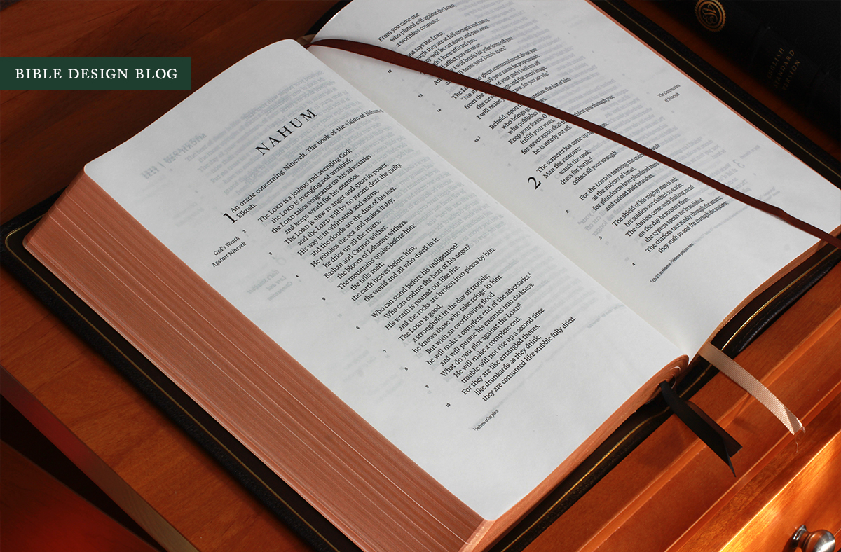
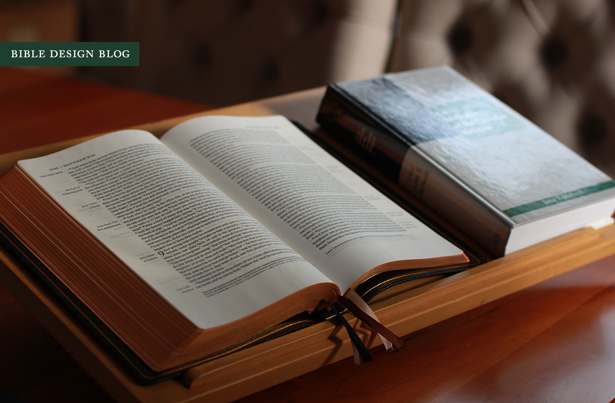
I have already written quite a bit about the Legacy's design, so I won't repeat everything here. Let me say this much: this elegantly proportioned single column, paragraphed ESV with generous margins is the Bible open on the desk stand in my office. When size isn't a concern, it's the Bible I'm most likely to carry (the Clarion hopping forward when size does matter). It's the Bible I'm most likely to teach and preach from, too. Crossway did an amazing job designing this text setting. It does great honor to the content on the page.

IT'S ALL ABOUT THE PAPER
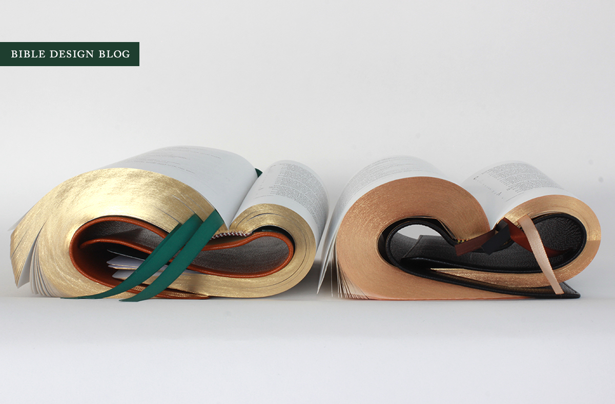
Since I love the Legacy typeset and love Jongbloed printing and binding, news of the Heirloom Legacy pleased me to no end. Right off the bat, though, there was a red flag: my beloved Legacy was being reprinted on something other than my beloved 36 gsm Thincoat Plus. The Heirloom Legacy, printed and bound by Jongbloed, uses 28 gsm Indopaque with an opacity rating of 79% compared to the original's 85%. Would the savings in thickness be enough to offset the loss of opacity? That was the question.
By its very nature, thin paper allows the printing on the reverse of the page to show through, not to mention the printing on subsequent pages. As you read, it's as if you're picking the words out from a hazy five o'clock shadow. To minimize the effect, designers and printers have recently focused on line-matching, the idea being that if the words on the back of the page are printed precisely beneath the ones you're trying to read, you don't have as much gray to contend with. It makes a difference.


Another factor that makes a difference is the darkness of the print impression. A bolder impression on the page you're scanning -- i.e., blacker words -- creates higher contrast that makes reading easier. The lower contrast of a fainter print impression contributes to eye fatigue during extended reading.
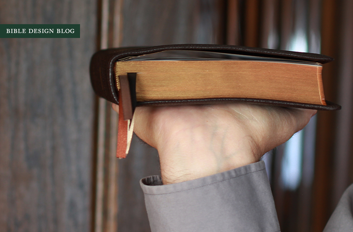
The question at the back of my mind since I began using the Heirloom Legacy a couple of weeks ago is whether the slimmer edition with its thinner, less opaque paper could ever replace my original Legacy. The answer is yes. And no. I prefer the feel of the thicker Thincoat Plus and prefer it's whiteness, too. Yet the difference in opacity hasn't made itself felt too strongly, and I really like the Heirloom Legacy's svelte form. During my testing I had the opportunity to use the Heirloom Legacy in the pulpit, where having a slimmer Bible to juggle along with my notebook and other papers made a difference. While I was expecting to prefer the original by a wide margin -- no pun intended -- now I'm leaning in the other direction. Given how beautifully my rebound Legacy turned out, it's a tough choice; if you're comparing the original Crossway bindings to the new Heirloom edition, there's really no comparison. It's the Heirloom by a mile.
Here's the secret, as far as I can tell: while the paper is thinner, the Heirloom's print impression looks slightly darker, and its line-matching is consistently good. Like the Cambridge Clarion at its best, the Heirloom uses a combination of strategies to mitigate the potential downside of moving to thinner paper.


AN HEIRLOOM BINDING
Well, it's not all about the paper. The Heirloom features one of Jongbloed's beautiful edge-lined goatskin bindings, with a bonded leather liner and a gilt line around the inner perimeter of the cover. Unlike the Heirloom Thinline released earlier this year, the Heirloom Legacy's cover features raised bands on the spine, an elegant touch that contributes mightily to the beauty of the binding. Has Jongbloed done this on a goatskin binding before? If they have, I don't remember. And I think I would remember. It's very nice.


There are four ribbons, which may seem like a lot. I can tell you, though, my Sunday sermon needed all the markers it could get. Four is not too many. Those of us accustomed to the luxurious thick ribbons used for R. L. Allan and Schuyler will find them on the thin and short side. They work, though, and that's the point. Here's an interesting fact about the color choice for the ribbons, which are black, brown, a sort of copper-brown, and tan-ivory. Thinking this was an odd pairing with the black goatskin cover, I asked about the significance. The decision goes back to the Omega, the original Crossway + Jongbloed collab. Turns out there were two editions of the Omega: the one available commercially, which featured two black ribbons, and an in-house version for gifts and giveaways that had four ribbons using these colors. The Heirloom Legacy ribbons are an homage to that limited edition. (I shouldn't put the thought in your head, but you collector types will probably want to be on the lookout for these rare Omegas.)
IN LOVE WITH DEEP BROWN
I'm sure it comes as no surprise that I am charmed by the deep brown cover. This is bomber jacket brown, dark enough to read as black in certain light. I hate using the word 'espresso' to describe, say, dark brown wood finishes, but this is the term that kept coming up when I showed this Bible off to my wife. It doesn't help that I've experienced an epiphany over the past year where dark browns are concerned, after realizing that I have maybe 20 pairs of shoes in various shades of tan but I'm always hunting for something darker. Dark deep brown leather is versatile, and doesn't call attention to itself. If black shoes are sober and tan are showy, dark brown manages to convey a stylish sobriety. Obviously leather shoes and leather books aren't exactly the same, but I think the same principles apply.
Jeffrey Mellema included a nice photo of different shades of brown Bibles in his write-up on the Heirloom Legacy, which is well worth your time. There have been some beautiful brown editions of the Bible published in recent years. I'm quite smitten with the deep brown Heirloom Legacy, I have to confess.


A DIGRESSION ON THE HINGE
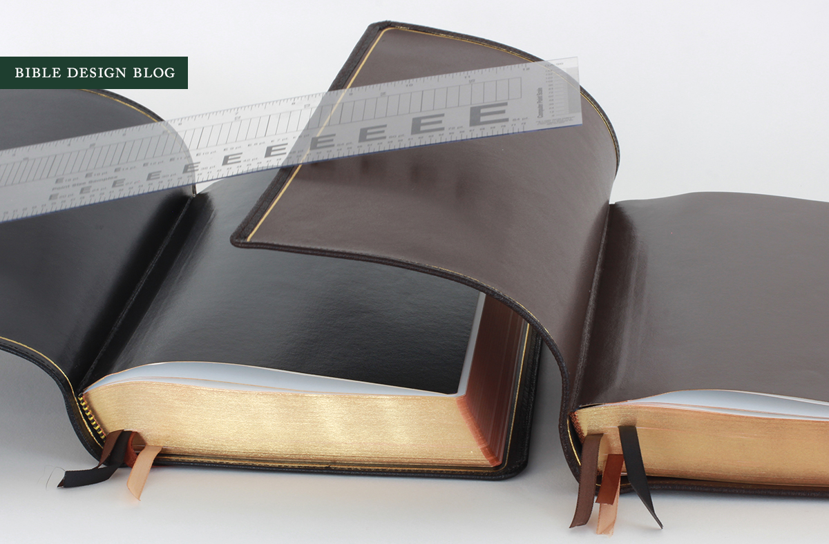
The only fault I find with the binding is the stiff hinge that anchors the book block to the endpapers, something I've written about at length when describing the Heirloom Thinline and the bindings Jongbloed has done for Schuyler. The first time I noticed this, I thought,"Hey, they've changed the material they're using on the spine!" Going back, though, I've found the same thing in bindings for Cambridge and R. L. Allan from several years ago. It goes to show there are things you don't notice, even when you're going out of your way to nitpick the details. Now that it's on my radar screen, I'm bringing it up a lot. Why is the inflexibility of the hinge an issue? Because it prevents this Bible from opening flat. Let me illustrate the point with a screen capture from Crossway's video:
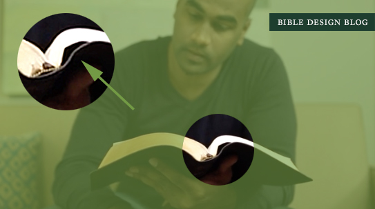
Notice the gap between cover and book block? That's the culprit. There's a stiff material cupping the spine and extending maybe an inch on either side, to which the endpapers are attached. Unlike the limp cover, this material doesn't fall flat when the Bible is opened. This creates two problems. First, because the spine isn't free to open fully, the text columns on the page are closer together than they should be. In photos you will notice that text near the gutter appears slightly rounded compared to text farther from the center of the book. Second, the stiff hinge also pushes outward on the goatskin cover when the Bible is closed, rounding the leather away from the spine.

Now I'm the first to admit that this is a minor point. In a consumer review, I'm not sure how much time I'd give it. But Bible Design Blog focuses in depth on design and production issues, putting a microscope on the minutiae. These stiff hinges haven't prevented me from enjoying Bibles in the past, and if nothing changes, so be it. But I would love for Jongbloed to explore its options and find a more flexible material that would allow the book block to open fully in sync with the limp cover.
TAMING THE HINGE
In the meantime, what can be done? While I haven't spent enough time with the Heirloom Legacy to give you a tried-and-true method for taming the hinge, some preliminary findings might help. My first attempt involved isolating the hinge and working it back and forth gently to try and loosen it up. I did this by pinching the endpaper on either side, then followed up by running my finger down the gutter to open the hinge up. The results weren't very impressive: mostly this just made the hinge stick out more, bowing the cover. My second method seems to work better: I opened the Bible as flat as it would go, then applied gentle pressure to the highest point either side of the gutter, pressing them flatter. Repeating this process every 200-300 pages or so, I worked from the front of the Bible to the back. While this didn't fix the problem, it did result in a marked improvement.


THERE CAN BE ONLY ONE
If you're a regular reader, there's a good chance you own more than one Bible. Maybe you started your quest with the idea there was a single perfect edition to be discovered; by now, though, you see your bookshelf as a kind of toolbox, having reconciled yourself to the idea that the job -- coming to grips with the fullness of the Bible -- might be bigger than a single tool can manage. You have editions that are more conducive to reading, others for looking up passages, and still others for study. And you probably interact with Scripture via smartphone and computer apps more than you'd like to admit, despite being committed to the Good Book in physical form.
Still, there's something about the One Bible dream that speaks to me, the idea that in some desert island hypothetical, there might be a single edition of the Bible that could meet all my needs. That's the kind of role I see the Heirloom Legacy fulfilling right now in the Crossway line-up. An Heirloom Reader's Bible might change the equation, but for now, this edition takes one of my favorite typesets, beautifully printed, and gives it a great binding that feels good, looks good, and is going to last. If you don't want a shelf full of Bibles, if you just want to get a single copy and leave it at that, I'm not sure you could do any better than the Heirloom Legacy. It's really that good.
Crossway provided the black review copy seen here, and the deep brown came from EvangelicalBible.com, where the Heirloom Legacy lists for $149. Tell 'em you heard about it here.
