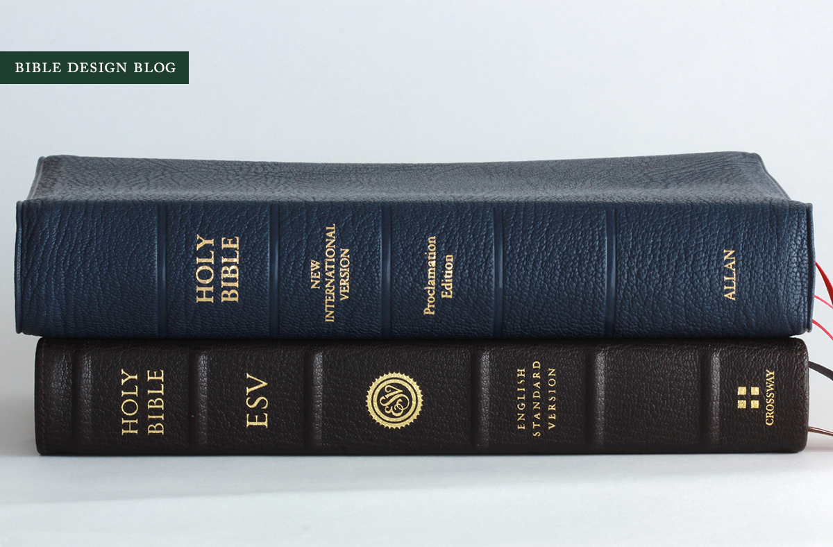
The R. L. Allan NIV Proclamation Bible in Navy Blue Goatskin
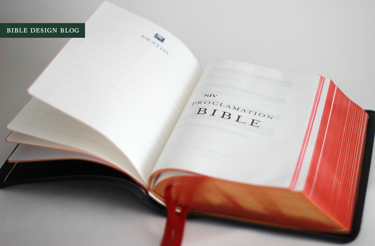
 This offering from R. L. Allan adds a luxury binding to the Anglicized edition of the NIV Proclamation Bible, published by Hodder & Stoughton. The edition is available in four colors: black, brown, crimson red, and the navy blue of the review copy pictured here. They list for £140.00 from R. L. Allan direct, and $219 from EvangelicalBible.com. Whichever color you chose, the Bible comes with a semi-yapp cover, art-gilt edges, three ribbons, presentation pages, maps, and lined notepaper in back. Inside the back cover you'll find a stamp proclaiming ALLAN FIRST EDITION.
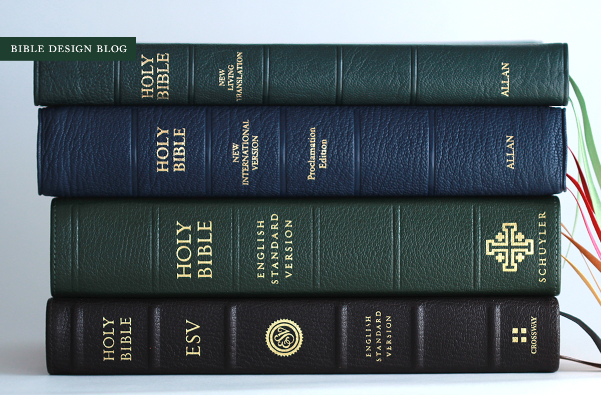
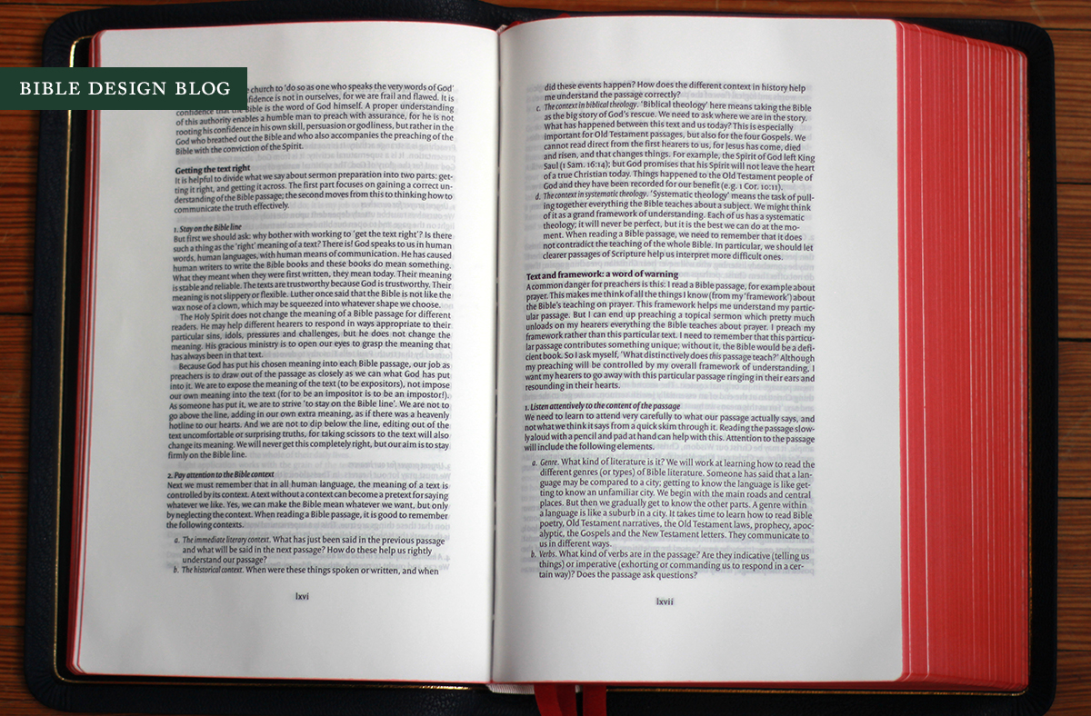
The Proclamation Trust developed this Bible for Hodder & Stoughton with expository preaching in mind. In addition to section and book introductions, it includes essays on the reliability of Scripture, how to find the "melodic line" when studying or teaching a particular book, how doctrine is developed from the text, how to prepare a sermon, how to lead small group and one-on-one discussion, and much more. The editor's preface sums up the approach this way: "If you have ever wished you could have just a few minutes with an expert at the start of your journey into a passage of the Bible, then here is a study resource which provides just that." Preachers and teachers will appreciate the NIV Proclamation Bible especially, though the material is accessible enough for any reader to enjoy.
Ian Metcalfe oversaw the development of the NIV Proclamation Bible from the Hodder end before taking over the reins at R. L. Allan, which adds to the significance of the project in my mind. For those of us who would love to see Allan develop and publish its own book blocks to go with the luxury bindings, this hints at what could be.
The NIV 2011 text itself is set in an attractive two-column layout by Blue Heron Bookcraft. I rave about the text setting every time I see it, and have done so for years despite the fact that I much prefer single column layouts. What's the appeal? Maybe it's the dotted lines that set off the center column references. I'm a sucker for details like that. Perhaps it's the typeface -- I am especially fond of the way those boldface section headings jump off the page. Whatever the reason, hats off to Blue Heron for design work that has stood the test of time and almost persuaded me -- almost! -- that I can live without a single column.
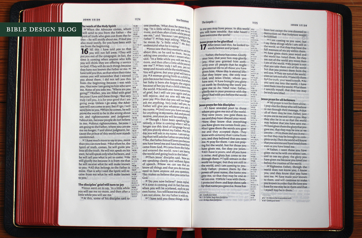
There are a few quibbles to make, though. Ever since my interview last summer with Bibliotheca's Adam Lewis Greene about his decision not to justify the text, the gaps between words in justified text columns have been jumping out at me. Once they whispered, now they shout. A narrow column of justified text can't help inserting wider gaps between individual words to balance things out. Reading the NIV Proclamation Bible I found myself noticing the occasional gap, not to the point of distraction but certainly more than I would have in the past. Another thing that always bugs me is when a two-column setting imposes awkward line breaks on versified text, especially when it results in a single word dangling alone on a line to itself. While the Schuyler Quentel seems to avoid this, I noticed it a number of times with the NIV Proclamation Bible, as in the photo below:


The typeface is Versa Pro, which is familiar from other text settings (for example Nelson's single column NKJV, later reprinted by Schuyler). The The book block is printed by CTPS in China. Since I haven't seen any indications otherwise in the product descriptions, I assume the paper spec -- a 35 gsm sheet from Spain called Especialprint -- is the same as the Hodder editions.
For some of you, I know China-printed book blocks in a high end binding are a deal breaker because they're received as cheap and therefore incongruous with the nice cover. I'm not trying to win anybody over -- it's an old argument and I respect all sides -- but I have to say that this Bible doesn't feel cheap, not on the outside and not on the inside. While I would have preferred consistent line matching and less ghosting, my reading experience was good, comparable to what I've had with Crossway's China-printed book blocks. The print impression is nice and dark, and consistent from page to page throughout my review copy, which, combined with the 9.3 pt. type makes the NIV Proclamation Bible a fairly easy read.
The product description gives the page size as 9" x 6". The cover on my review copy measures 10" x 6.75", and the book is right at 1.5" thick. While that's not compact, considering the fact that you get 9.3 pt. type, an outer margin that runs 0.75" wide, and a bottom margin clocking in at 1", it's still pretty handy. Since the book opens flat on a podium or tabletop, you shouldn't have any trouble teaching or preaching from it. Too big for casual carry, perhaps, but for its intended purpose the NIV Proclamation Bible works quite well.
Turning our attention to the binding, one thing that really stands out about the NIV Proclamation Bible is the rounded spine. If you ask me, every Bible ought to have one. Here's a photo to help illustrate what I'm talking about:
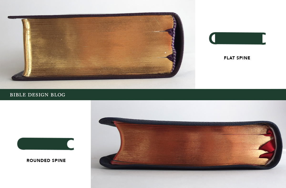
A rounded cover doesn't mean anything. Plenty of rounded covers conceal flat-spined book blocks underneath. What we're talking about here is the rounding of the book block's spine, which changes the profile of the block when viewed from top or bottom. Instead of a rectangle with ninety degree corners, both ends curve in the shape of a C. Rounding the spine is an additional step, and while I wouldn't go so far as to say that a flat spine connotes inferior quality, the rounded spine is one of those bookbinding grace notes I appreciate more and more as the the step is increasingly neglected.
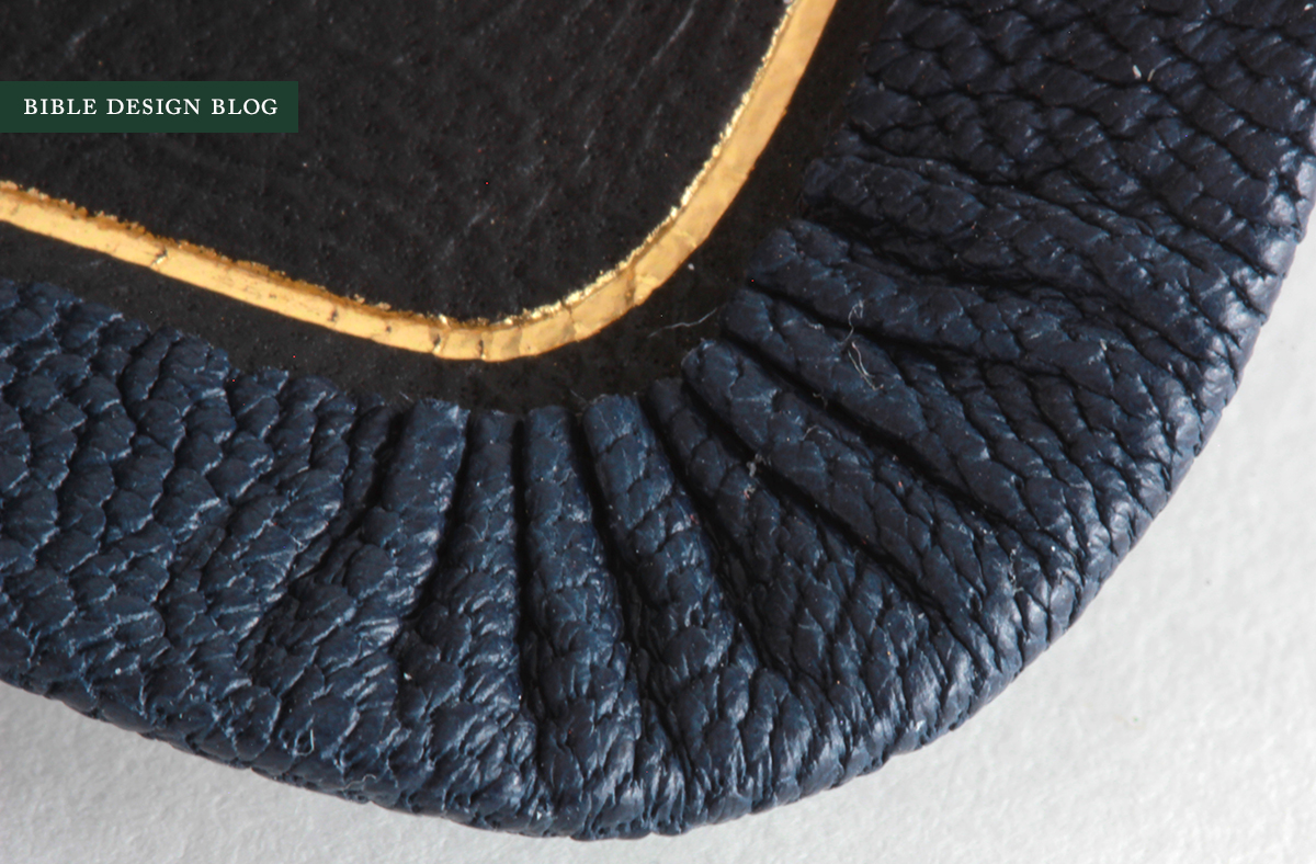
The edge-lined cover in natural grain Highland goatskin makes for a limp Bible. As always, the fit and finish on this London-bound book is impressive. Because Allan bindings are consistently beautiful, there's always a danger of taking their loveliness for granted. The details here are truly splendid, even up close.


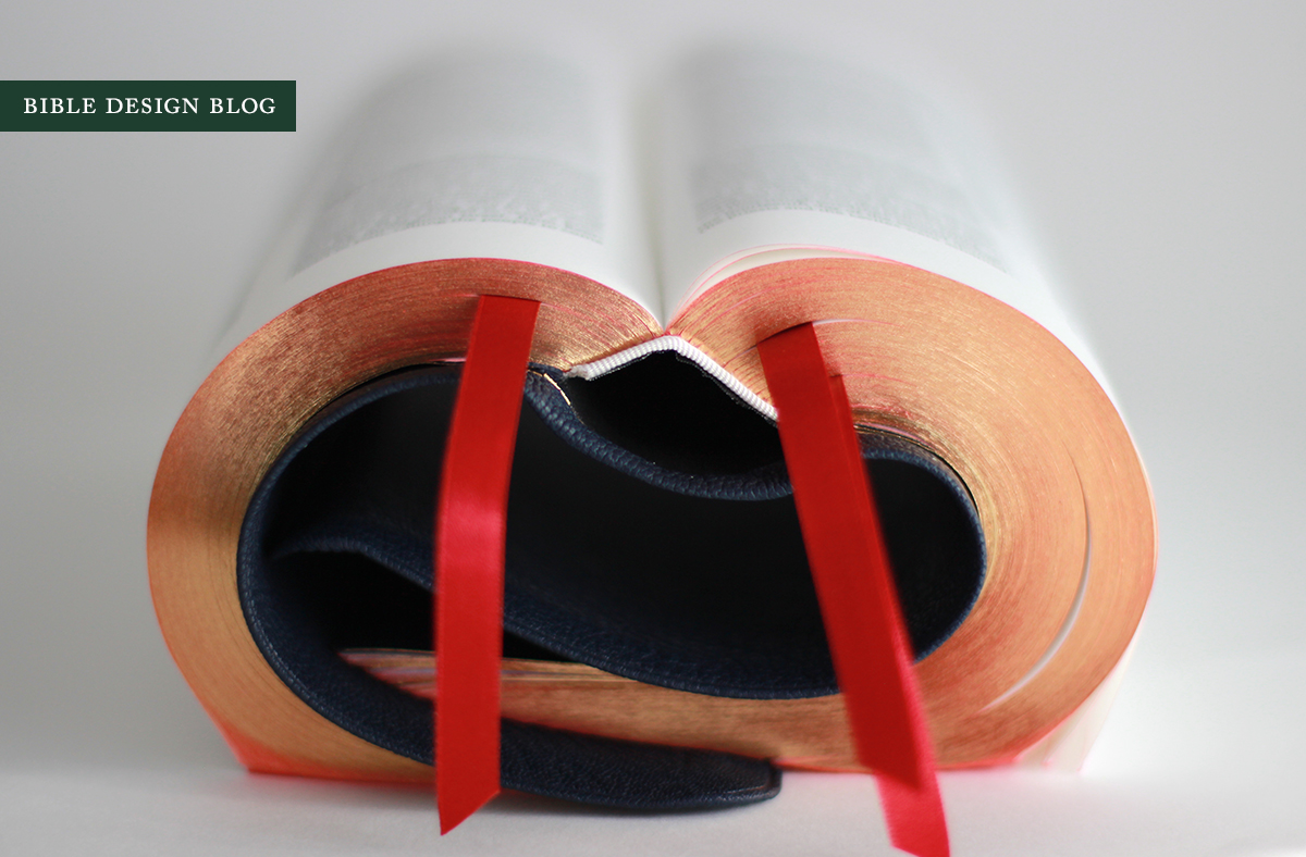
The limp Allan binding inspired by first experiments with Bible yoga, and the NIV Proclamation Bible doesn't disappoint on this score, either. You won't encounter many situations in life that necessitate rolling your Bible backward into a leathery cylinder. Rest assured, though, should the need arise, you'll be ready:

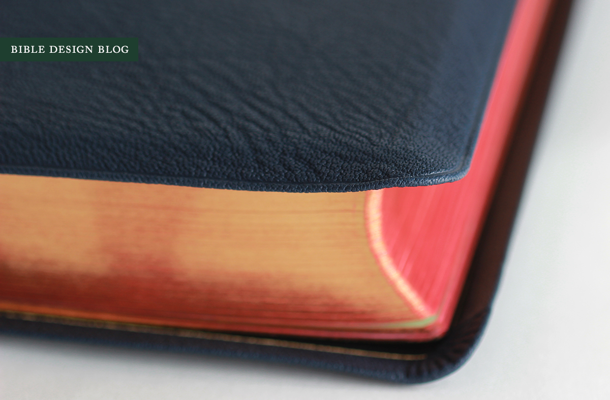
The only gripe I have with the navy blue binding is the black liner. You know how I feel about black liners inside non-black covers. Look, here's the deal: sometimes black is the closest match available in a limited range of options. I get that. But I want publishers to exhaust their options before settling for black, because it just looks lazy. A navy lining would be lovely in this Bible. Personally, I'd have gone with scarlet to match the ribbons, but then I've always loved those staid navy blazers that blow open to reveal a retina-scorching red lining. The way I'm coping with the black liner in this case is simple: I pretend it's midnight blue.

Why would you spend over $200 on this edition when you could pick up the Hodder version for a lot less? If the font size and extra margin aren't a major draw for you, it's not an unreasonable question. Here's the way I see it: an investment like this makes sense when you find the Bible you're going to be using day in and day out. The aesthetic pleasure we derive from a well-made book isn't hedonistic self-indulgence. To me it's akin to the satisfaction a craftsman feels when working with good tools.
And this is a good tool. It feels right in your hand, it feels right as you flip the pages and scan down the columns. The Allan formula has been refined by now to the point of rock solid consistency. Their Bibles are dependably fine. If you're intrigued by the idea of a Bible put together with expositional preaching in mind, and plan on using it on a regular basis, the R. L. Allan NIV Proclamation Bible will make a wonderful companion.