The ESV Reader’s Bible, Six-Volume SetPart 1: Simply Beautiful
This is Part 1 of Bible Design Blog’s extended look at the new 6-Volume Reader’s Bible published by Crossway. This post gives an overview of the project and shares my general assessment of its success. In later posts I will dig deeper into some of the details, from the typography and paper to slipcases. For a complete list of articles, scroll to the bottom of this post.
The ESV Reader’s Bible, Six-Volume Set arrived on my doorstep on the fifteenth of August at 12:53 p.m. It was a warm day, pleasantly windy. The box felt heavy in my arms. I set it on the dining table and went in search of a knife. Before I opened the package, I studied the printing on the side: Legatoria Editoriale Giovanni Olivotto, with an address in Vicenza. The moment felt a bit momentous, so I did something I never do: snapped a photo of the unopened box. I hate unboxing videos. I’m temperamentally opposed to watching a grown person open a package online and linger adoringly over invoice, brochure, and packing peanuts. I resisted the urge to violate this conviction. But only just.
I don’t get excited about Bibles anymore. That’s what I kept telling myself, anyway. For almost a decade I’ve been writing about quality editions of the Bible, poring over details of print and paper and binding. Publishers send review copies, and if I’m interested in what I see, I write about them. When I meet my readers in person, two questions always come up: “Why don’t you post more often?” and “How cool is it that publishers send you free Bibles?” Well, it is cool, but not screaming-like-a-kid-on-a-rollercoaster cool. I’m a professional, after all. Sort of.
So I opened the box and lifted the wooden slipcase from its cushioned berth, pretending that I wasn’t jumping up and down on the inside. I was, though. A lot. And the more time I spend with the 6-Volume Reader’s Bible, the less reserved I get. This is a beautiful concept executed beautifully. It’s one of the best editions I have ever covered at Bible Design Blog.
A Beautiful Concept
Good book design should be reader-friendly. Some texts present more of a challenge than others. Novels are easy. Bibles are hard. Scripture consists of sixty-six separate books of various lengths (more if you include the Apocrypha). That’s a lot of words. The simple task of designing a single volume to hold all that and still be readable is a challenge. Then you add all the chapter and verse numbers, the cross-references, the concordances, and the task becomes rather difficult. No matter how good the designer, certain compromises are inevitable: minuscule text, two columns, ant-like armies of references crawling down the margins.
This is what we’re used to.
The history of the printed Bible began in the mid-to-late fifteenth century and quickly became the history of the reference Bible. As Glenn Paauw relates the story in his excellent Saving the Bible from Ourselves, the steady creep of extra-biblical material onto the page resulted by the mid-sixteenth century in the reference edition more or less as we know it today. “It was the death knell for a certain kind of Bible,” Paauw writes, “a Bible that presented something closer to what the Scriptures inherently were.”
Reader’s Bibles are an attempt to unring that bell. They remove the extras and give the biblical text room to breathe. They offer up Scripture in a flowing single column paragraphed layout. They design the Bible like the kind of book you actually read, instead of the sort you only use for looking things up.
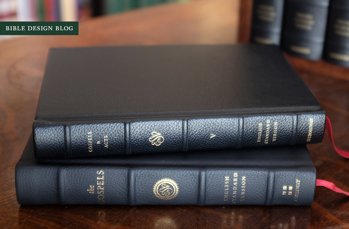
Crossway released an excellent ESV Reader’s Bible in 2014. In my review, I expressed the hope that the format would catch on. “I’d love to see one of these on everyone’s shelf, regardless of your preferred translation,” I wrote. “This is a format to spend some time with in the hope of recapturing a less mediated experience of reading the Bible.” Crossway has also published reader-friendly formats of The Psalms and The Gospels (see below).
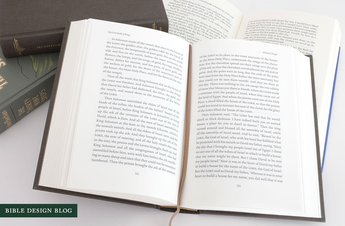
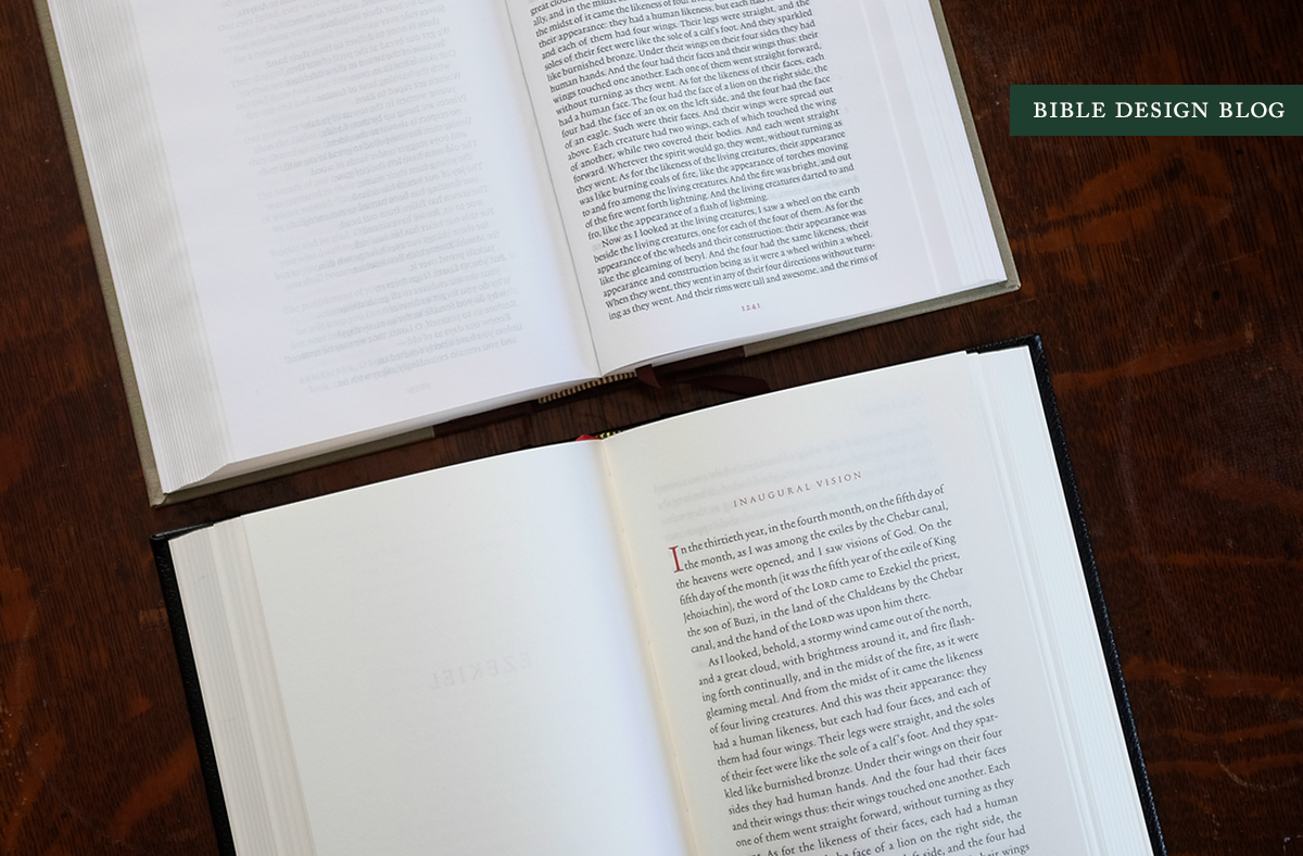
For some people, the idea of a multi-volume edition of Scripture might be a hard sell. Why would I want a Bible in six volumes, far too heavy and cumbersome for easy portability, when I can have the whole epic story under one cover? Well, dividing the text into multiple volumes actually solves one of the greatest challenges associated with Bible printing: the necessity for sheer, ultra thin paper. Compare the original single-volume Reader's Bible with the new ESV Reader’s Bible, Six-Volume Set and you'll notice one thing right away. The pages in the new set are much more opaque. See, as long as you’re fitting all those words under one cover, thin speciality paper is a must. Dividing the sixty-six books into six separate volumes frees you from that necessity. Whereas the one-volume Reader’s Bible was printed on 30 gsm Apple Thin Opaque paper, this one is printed on 80 gsm Munken Premium Cream. The sales literature describes it as “opaque and soft without being too bulky,” which is right on. Another way of putting it would be, this just feels like a nicely made book. You won't think about the paper at all. You'll think about the words on the page.

It helps to stop and consider what kind of set this is. The 6-Volume Reader's Bible isn't going to replace your fine print all-in-one edition. That's not the point. Rather, it fills a niche that has largely gone unaddressed in the past: the need for a Bible designed for a lifetime of reading.
When I develop a love for a particular author, one of the things I do is search for nice editions of that writer's work. Last year a friend pulled me into a reading challenge: together we would make our way through all of John Buchan's Richard Hannay novels, from The Thirty-Nine Steps to The Island of Sheep. Since I was planning to spend a lot of time with Buchan, I hunted online for a set of the Folio Society edition of the novels. The five novels are beautifully designed and bound, grouped together in a sturdy slipcase. (Sound familiar?) When you look at the Folio Society set side by side with the 6-Volume Reader's Bible, a light bulb should illuminate above your head: "Ah ha! So, that's the kind of thing this is."
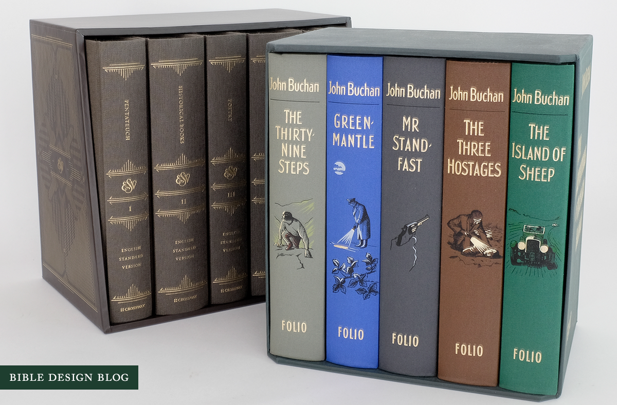
And the 6-Volume Reader's Bible is quite a good example of that sort of thing, too. In all its details, from design to printing to binding, it compares favorably to the work of high end publishers like the Folio Society.

A Beautiful Execution
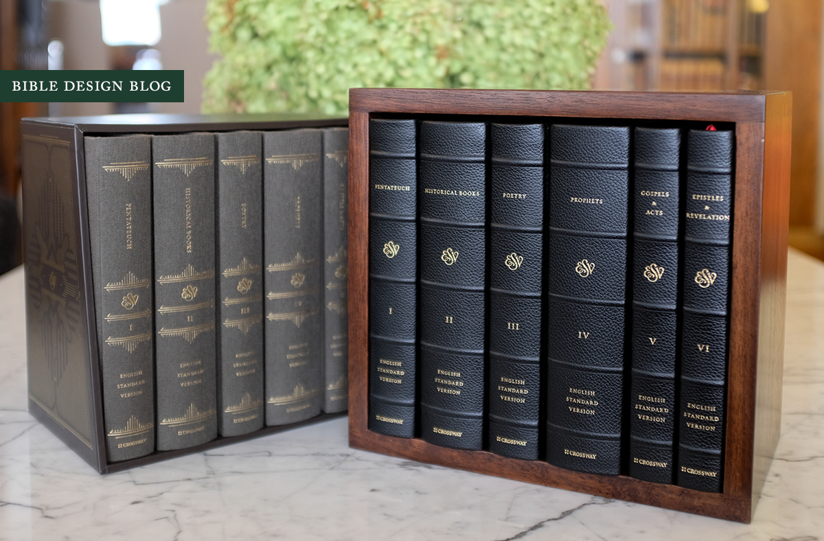
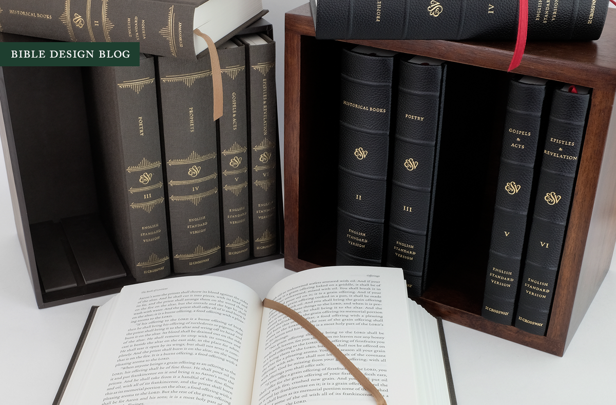
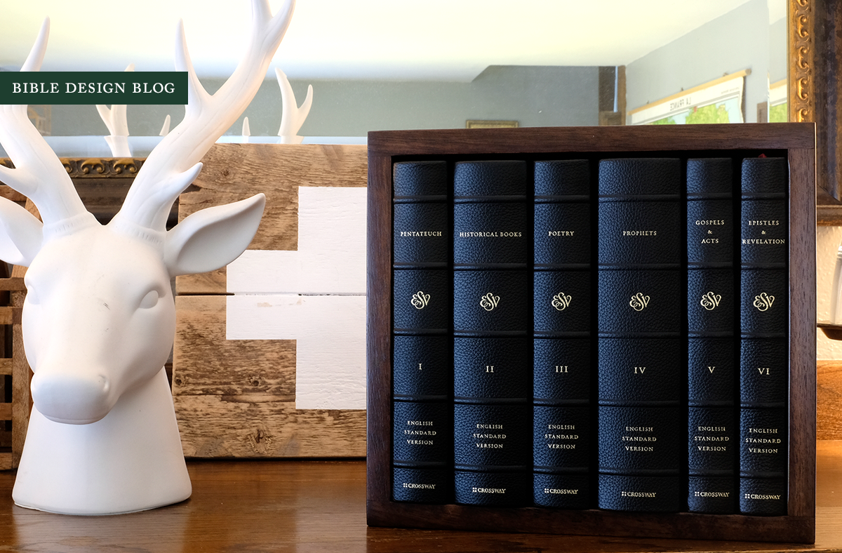
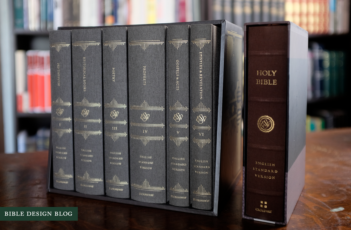
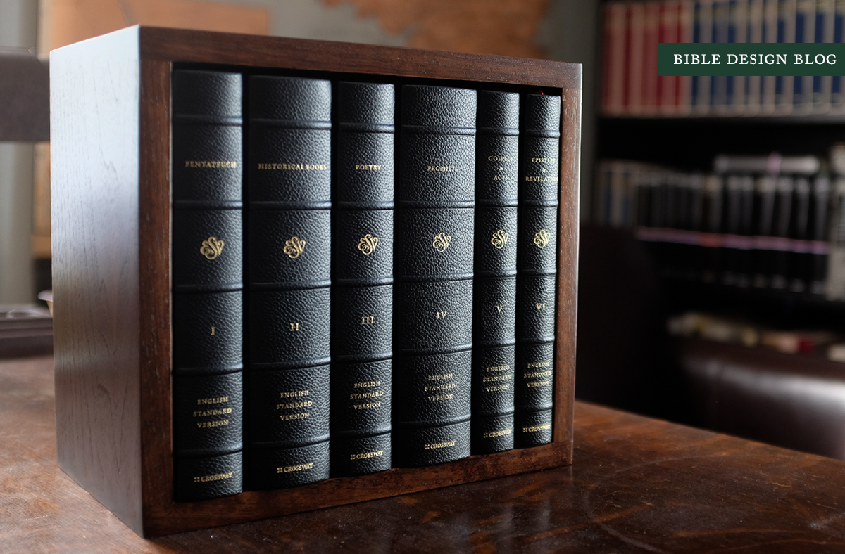
There are two versions of the set, one bound in cloth-covered boards with slipcase ($110) and another bound leather-over-boards with a dovetailed walnut slipcase ($300). The leather-over-boards set is an EvangelicalBible.com exclusive, by the way. Considering the cost of high quality Bibles these days, the leather set feels like value for money. Both options ooze with distinction, though.
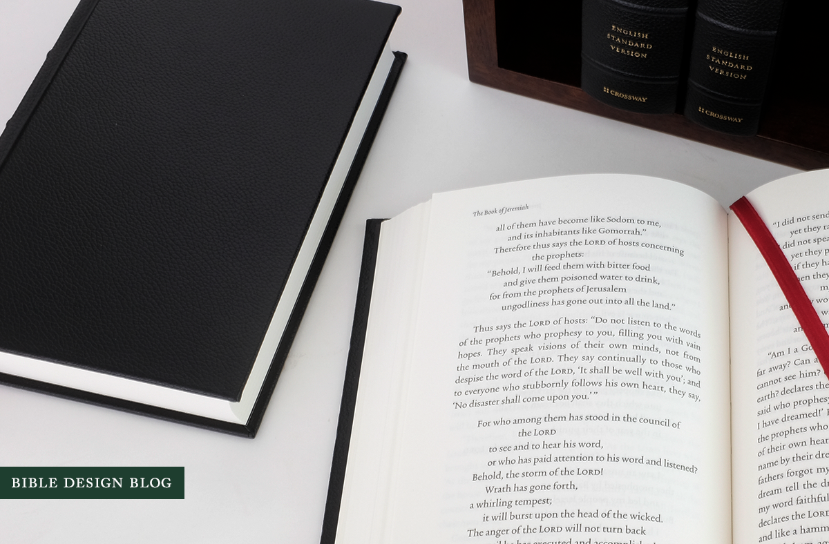
The interior design is new for this edition. The text is set in 12 pt. Trinité No. 2, a typeface “inspired by the ideal harmony found in Renaissance incunabula,” and the lines of text are generously leaded. A single page in the original Reader’s Bible contained 42 lines of text. In the 6-Volume Reader’s Bible, there are just 28. Apart from the occasional section heading, running headers at the top of the page, and the actual page numbers, there is nothing on the landscape but a gloriously proportioned single column text.
In other words, when you open the 6-Volume Reader’s Bible, what you see is just a well-designed book. No clutter, nothing to call attention to itself. Here’s a telling observation: when EvangelicalBible.com posted the first photos of these sets online, creating a bit of a social media sensation, I snapped a photo of the one I happened to be reading and posted it on Instagram. No feeding frenzy, though, because I photographed the book opened on a table, where it is pretty much indistinguishable from any other book — which is the point. (One commenter did get wise: “That looks suspiciously like a Bibliotheca volume.” Well, close.)
Crossway has produced a video that gives us a look inside the production process:
ESV Reader's Bible, Six-Volume Set (Trailer) from Crossway on Vimeo.
A wealth of production information is included in the booklet accompanying the set, too. The books are printed and bound in Italy by Legatoria Editoriale Giovanni Olivotto — L.E.G.O. for short. Printed on a Timson T48 offset web press, the 48-page signatures are gathered into books and Smyth-sewn. The cover cloth is Manifattura Tasmania 7107 stretched over 2.25 mm board and the ink, in case you’re wondering, is Inkredible Revolution Black. The leather bindings are done in lightly grained black cowhide with a nice sheen.

A Beautiful Read
All of which means little if the 6-Volume Reader’s Bible isn’t a delight to read. Well, it is. It truly is. Each volume, thick or thin, feels good in the hand. They have a trim size of 8” x 5.5” — the same as the original ESV Reader’s Bible — which makes them comfortable to hold. Unlike the leather-over-boards edition of The Gospels, they open flat and are not too bulky. The boards are relatively thin and the leather sufficiently pared to avoid extra thickness.
A deeper look at the paper is coming soon. Suffice to say, the 80 gsm sheets strike a pleasing balance between opacity and suppleness. As much as I love The Psalms and The Gospels, I find the paper in each volume a bit thick. Not here. I can hold these books open with one hand, read for a long period, and never be distracted by bleed-through or the feel of the pages. A well made book doesn’t call attention to itself, and these are well made books. In comparison to the leather-bound editions of those earlier reader-friendly volumes, too, L.E.G.O. has brought an extra level of refinement to the binding.

Each volume has a single ribbon for marking progress. I’m used to having two or three ribbons, so at first I wanted more. Then I remembered that this Bible actually has six ribbons, one in each volume. That’s plenty, right? You will need that ribbon, too, because a Bible like this invites deeper reading. I’m still amazed how much more I read, and how much more I notice in what I read, compared to traditional reference formats.

Recommendation
The question is, do you go with the clothbound set or spring for the leather? On aesthetics, the leather-over-board option wins. The deep black and warm brown combination of leather and wood is ridiculously handsome, not to mention ridiculously photogenic. I’m not as big a fan of the earth-tone cloth-over-board covers with their intricate design … until I handle them. The cloth has a nice tactile feedback, and the volumes feel great in the hand. There really isn’t a bad option here. If you can swing the leather set, though, it’s heirloom quality and I doubt you’ll regret it.
But here’s my real recommendation: find yourself a good reading chair. You will need it. The 6-Volume Reader’s Bible doesn’t want to sit on the shelf. It wants a special nook next to a comfy chair and a lamp.

The ESV Reader's Bible, Six-Volume Set Complete Series
"Reverent Joy": Crossway Launches ReadersBible.org, Releases Video
More to come!