Schuyler Canterbury KJV
The Schuyler Canterbury KJV Goatskin ($210): Black, Dark Brown, Dark Purple, Imperial Blue, Firebrick Red Calfskin ($110): Black, Dark Brown, Forest Green, Dark Red See links at the end of the article for more information and ordering.
Aimed at traditionalists in search of a heritage edition of the King James Bible, the Canterbury is set in 11 pt. Milo and printed on 36 gsm paper, line-matched to reduce show-through. The text setting features a classic two-column layout with justified text and verse-by-verse line breaks, except for poetry, which is set in single column verse. The book's dimensions are 6.125″ x 9.125″ with a thickness of roughly 1.75". It includes the Epistle Dedicatory, a defense of the translation against its original critics which also happens to present a useful corrective to some of its modern advocates. The Canterbury is available in both goatskin and calfskin bindings, with a leather-over-boards edition planned for the future.
THE CANTERBURY CONSIDERED
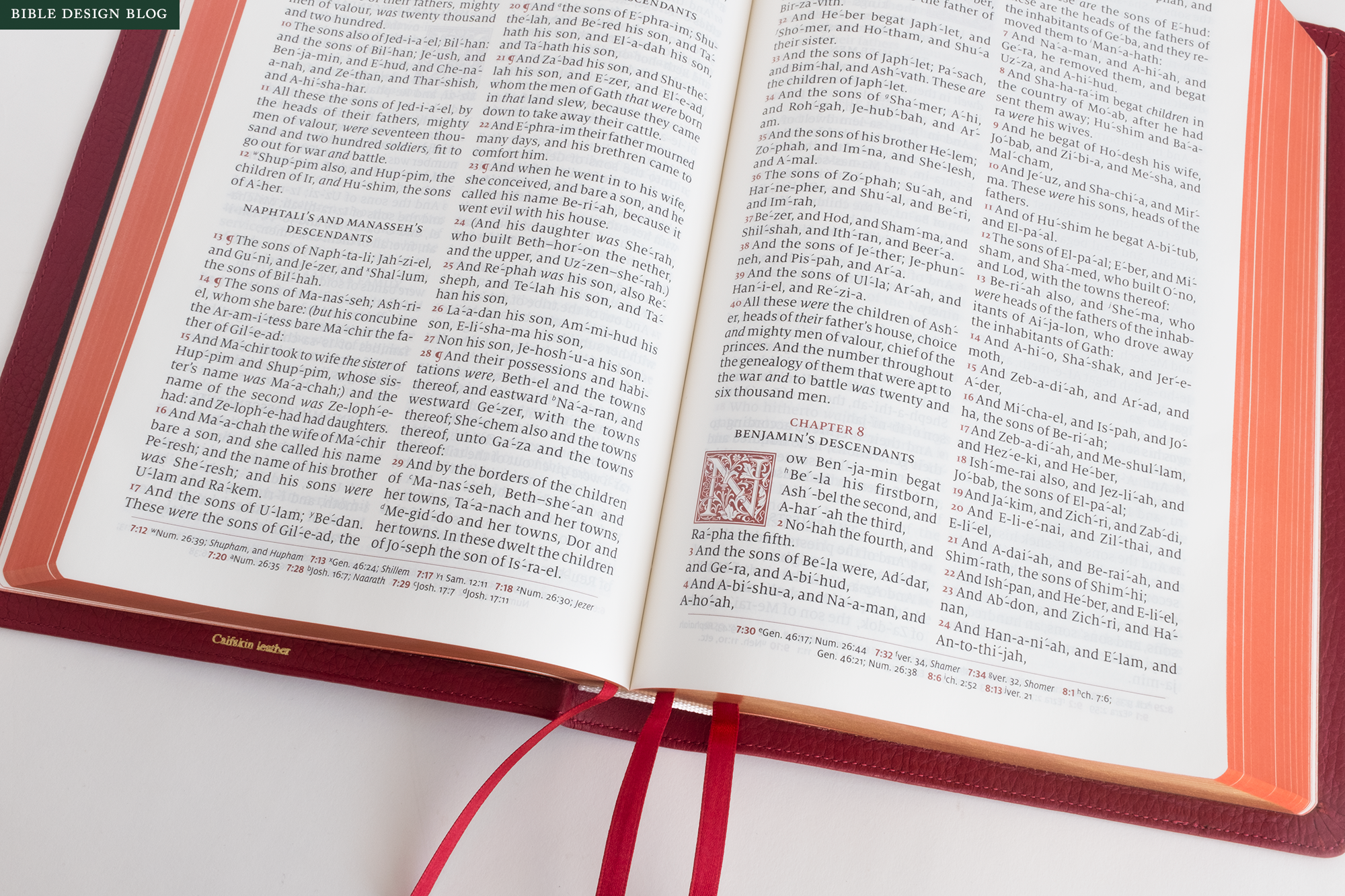
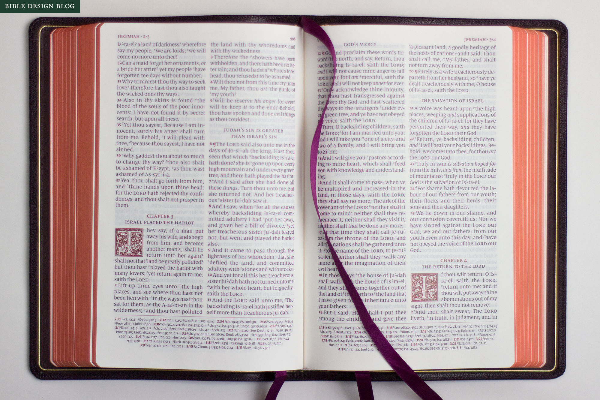
The Schuyler Canterbury refreshes the King James Bible’s classic design without straying too far from the template. Hallmarks of the traditional format such as two columns of text and verse-by-verse line divisions have been preserved. When it departs from the old pattern, the Canterbury adds some welcome modern touches — setting poetry in single-column verse, for example — as well as nostalgic ones like the ornate red capitals. The spirit of the Canterbury resides in those drop-caps, if you ask me. They give the page a whiff of Kelmscott. And the Canterbury is to the classic KJV what Kelmscott Press was to medieval books.
I will spare you the history lesson, but suffice to say, William Morris (of Arts & Crafts fame) founded the Kelmscott Press in the late nineteenth century. Nostalgic for the medieval period of his imagination, Morris made the kind of books King Arthur might have produced if there had been a printing press at Camelot. Like a Victorian castle or a Pre-Raphaelite painting, to the untutored eye they might appear authentically medieval. In fact, they are tributes to the past, and perhaps also a testament to how alienated their creator felt from the modern world.
In the same way, the Canterbury is not a reproduction of the classic King James Bible so much as an fresh interpretation of what it might have been. What if the classic typeset had been cleaner, more readable, and the poetry had been set as such? What if the page design had captured some of the ancient grandeur of the translation itself? The result is an edition that looks very traditional at first glance — at points it wants to out-classic the classic — and yet reveals itself with use to be a subtle, respectful improvement.

THE CHALLENGE OF PUBLISHING THE KJV
The King James Bible has a huge and loyal following, and the translation itself is in the public domain. For people looking to get into the business of Bible publishing, these two factors make the KJV particularly attractive. My inbox is full of proposals from aspiring designers looking to get into the game, and the KJV reigns supreme in those plans. What most do not appreciate is that, along with the advantages of a built-in market and a free translation come certain challenges.
That huge and loyal following, for example, is also very traditional. They don’t want you to tamper with the translation, certainly, but many would consider an update to the design just as great an offense. They want the ol’ KJV to look like the ol’ KJV. They do not want a more readable, more accessible KJV, and might even be suspicious of anyone who suggests that such a thing is possible. In other words: Innovate at your own risk.
Related to this challenge is the fact that such traditionalists already have an incredible array of options to choose from, including vintage editions no modern effort can hold a candle to in terms of paper quality and traditional design. If I thought the ideal Bible was a two-column, verse-by-verse reference edition of the KJV printed on gorgeously opaque paper and bound in beautiful tan calf by an ancient university press in the United Kingdom, well … I already have one. And if I can’t find what I’m looking for second-hand, then R. L. Allan has made a reputation for filling that particular gap.
Thus, the challenge the Canterbury faced was, how do you create something fresh and new for the KJV audience that appeals to traditionalists.
Schuyler has answered in two ways. First, they have created a text setting that looks more like the ol’ KJV than the ol’ KJV itself. Not just the double-column layout and the verse-by-verse line breaks but even the phonetic spelling of supposedly difficult words is maintained. This “self-pronouncing” feature has always struck me as one of the most ridiculous features of the old format, and growing up with it I never noticed that it made the task of pronunciation any easier for those who struggled, but it is certainly a distinct identifier proclaiming that the Canterbury has its eyes fixed firmly on its history.
But the ol’ KJV was never as dressed up, never as decorative as this. It never looked as fancy as it sounded. The Canterbury changes that, primarily through its ornamental capitals and abundant the use of red ink for contrast, something Schuyler has made into an art. To my austere puritan aesthetic eye, the result seems flamboyant to the point of excess. Yet to the traditionalists I’ve tested it on, the page looks exactly right. Maybe the KJV was never like this in reality, but the Canterbury fills them with a nostalgic sense of what the KJV once was.
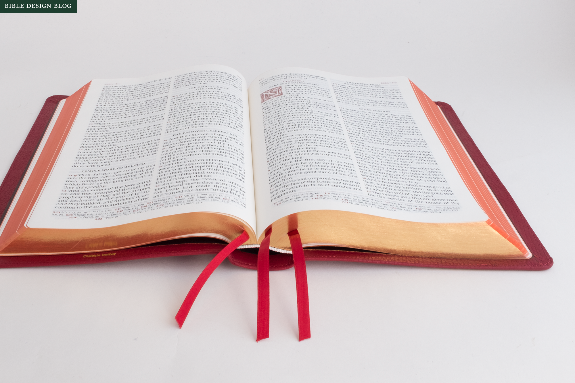
The second way Schuyler has answered the challenge is by introducing updates even a traditionalist can appreciate. The traditional KJV presents the Bible’s poetry as if it were prose. You cannot tell by looking that the psalms are a different kind of writing than, say, the epistles. I can still remember the first time I saw biblical poetry set as such. Frankly, it was a revelation, the drawing back of a veil. Not that the meaning of the poetry suddenly changed. It’s just that this typographical treatment struck me as a way of caring for, or paying attention to the text. Now it looked more like what it was, if only analogically, since Hebrew poetry marks itself as poetry via different means.
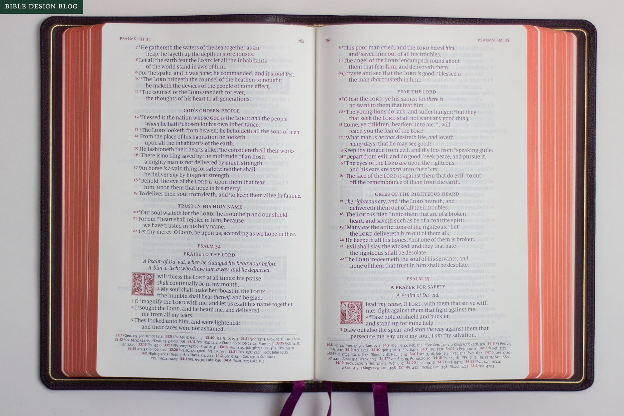
The Schuyler practice of eliminating center column references in favor of references at the foot of the page is also a welcome change. Center column references necessitate narrower text columns, which allow for fewer characters per line. Combined with justified margins, these narrow columns dictate the traditional KJV’s variable word-spacing and hyphenation. The Canterbury does not escape these problems—you really can’t escape them in a two-column, justified layout—but the slightly wider columns do help.
In a nod to the translation’s antiquity, the Canterbury includes a glossary of English words that have fallen out of use or changed in meaning over the past five centuries. Entries like ‘dross’ and ‘eunuch’ may be superfluous—at least, I hope they are—but knowing that ‘curious’ could mean ‘artfully woven’ rather than ‘inquisitive’ is helpful. And while there’s a part of me that believes concordances are obsolete in the digital age, Schuyler makes some of the most beautiful concordances. There are a handful of lined note pages in back, along with some excellent maps of biblical locales by Dr. Barry J. Beitzel. All the back matter is traditional in subject, yet executed with modern precision.
BINDING
The Canterbury continues the fruitful partnership of Schuyler as publisher, 2K/Denmark as designer, and Royal Jongbloed as printer. Together, they have made a number of beautifully designed and beautifully printed editions, some of the best production Bibles available.
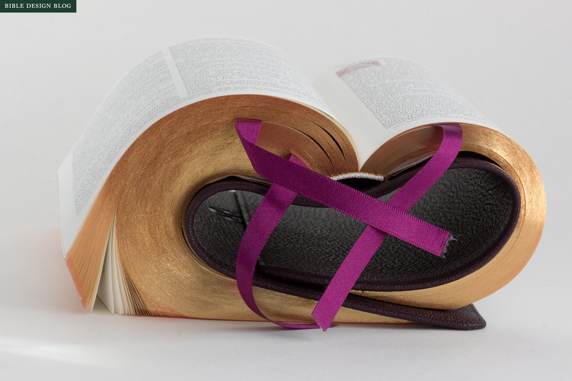
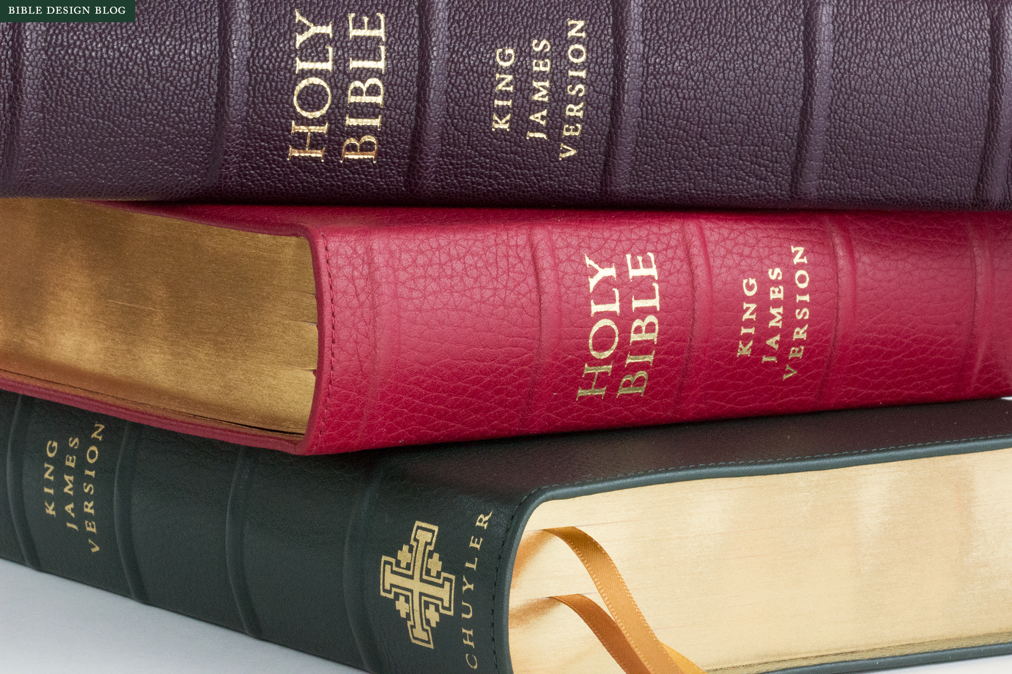
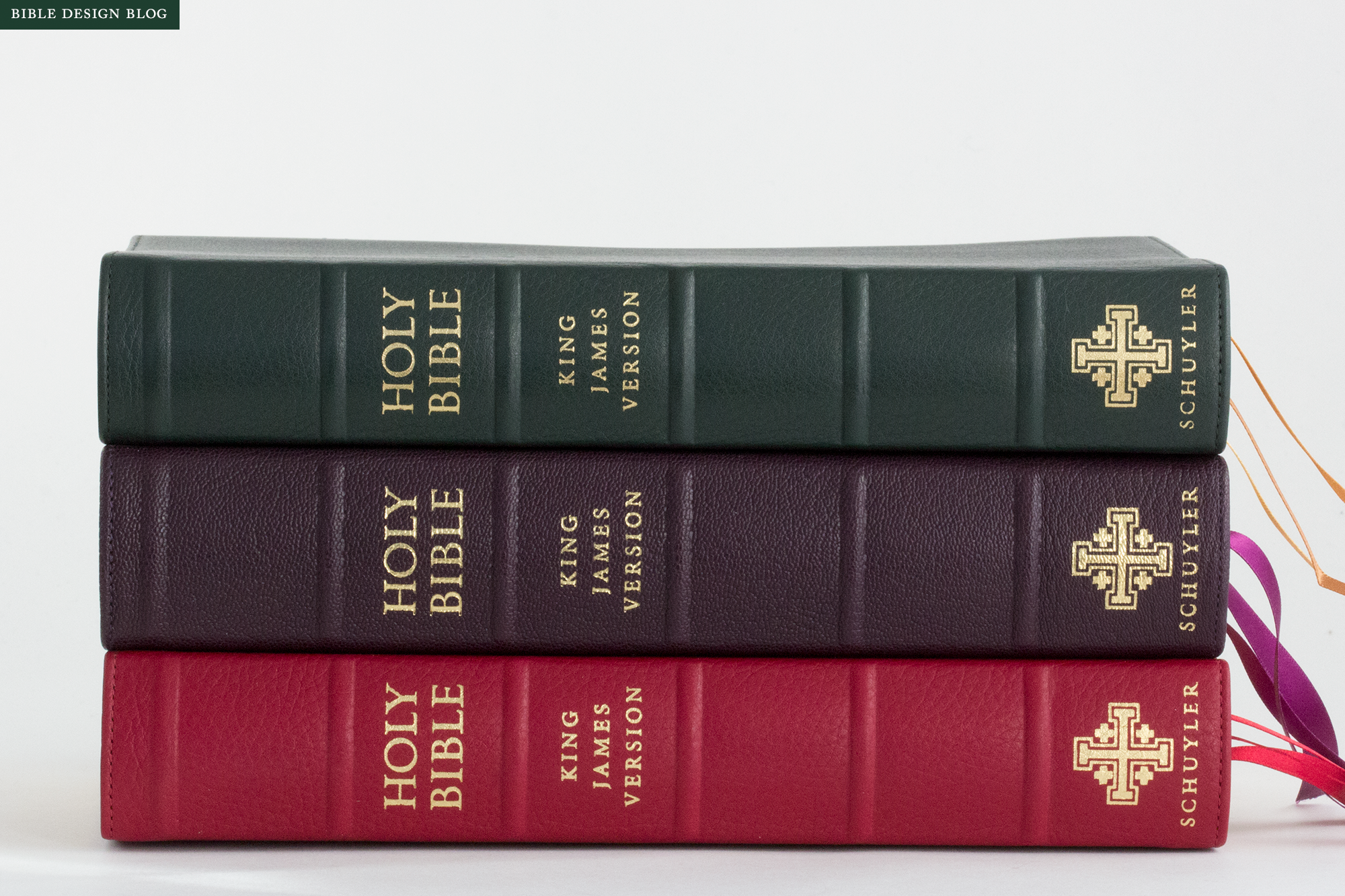
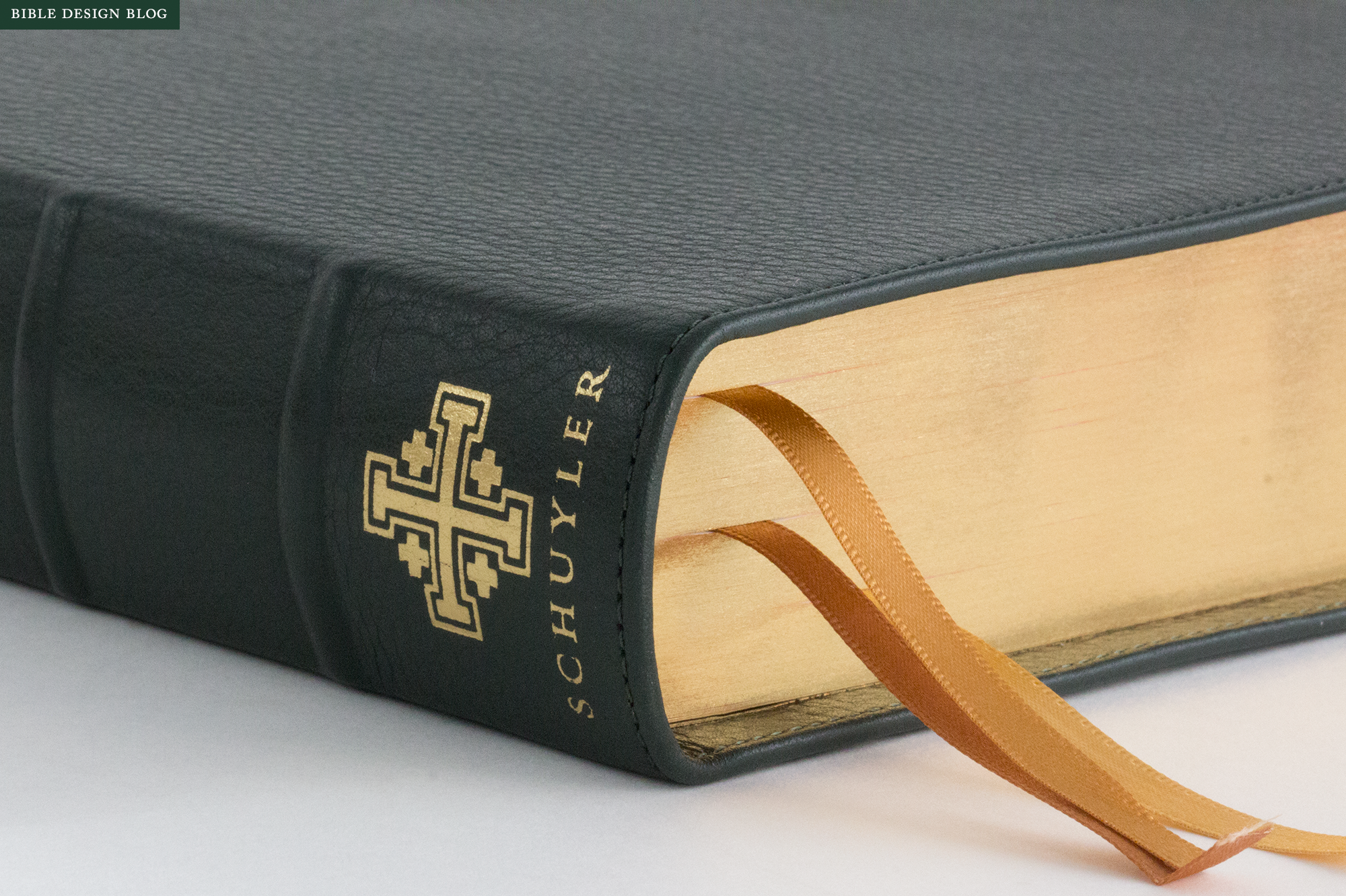
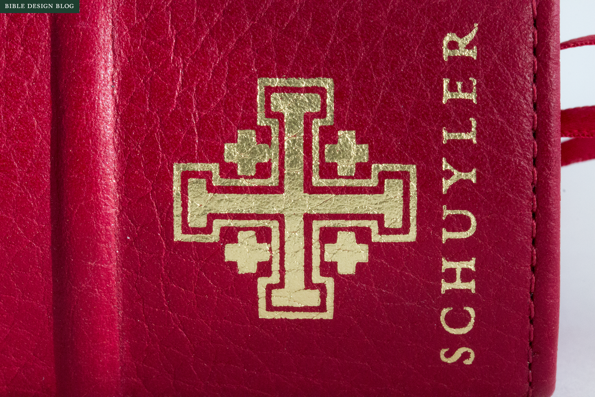
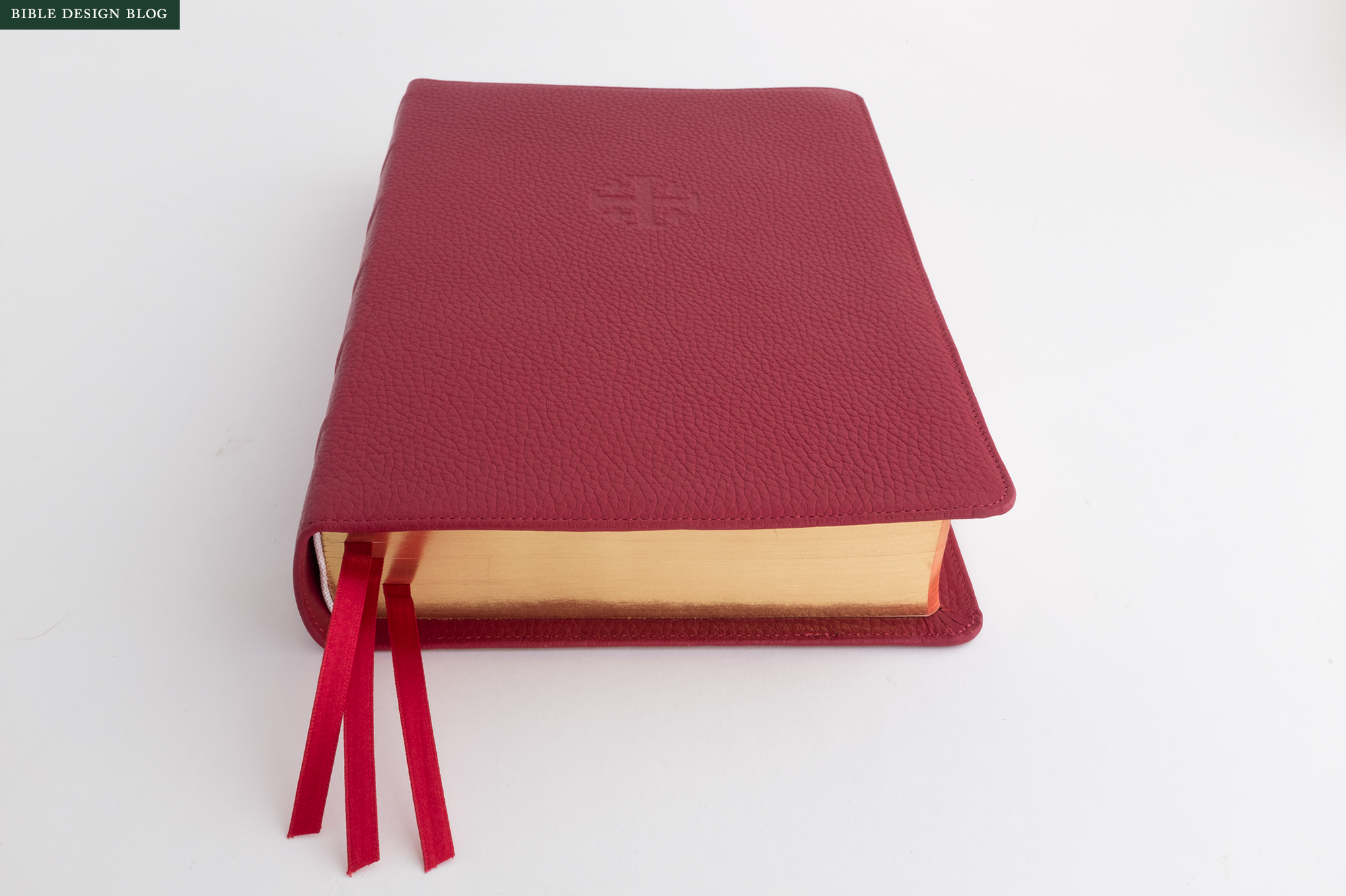
For as long as I can remember, I’ve been raving about Jongbloed’s limp goatskin edge-lined bindings. So liquid in the hands, such a nice pairing with the weight of a heavy book block. And they are so reliably good. Whether you’re considering the modern, clean-edge versions Jongbloed does for Schuyler and Cambridge, or the more traditional yapp edges they have worked on with R. L. Allan, a goatskin binding from Jongbloed is really wonderful, particularly when leather-lined, as the Canterbury is. In the photos, you see the purple goatskin option, which is already in short supply since the Canterbury’s release last month. Purple may be a little out there if you’re accustomed to basic black, but this is a tasteful liturgical shade, not too saturated, that shows off the embossed cross on the cover.
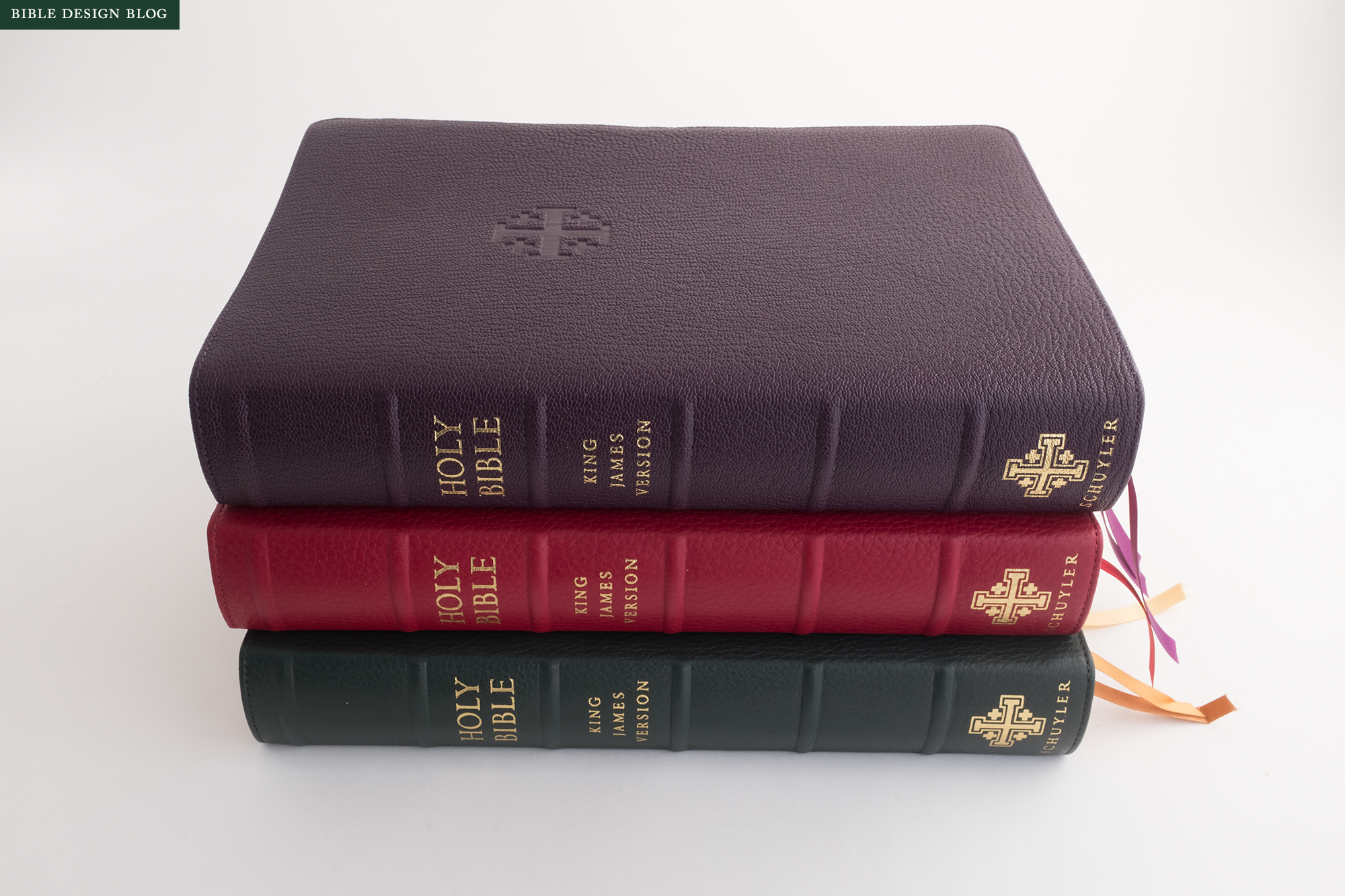
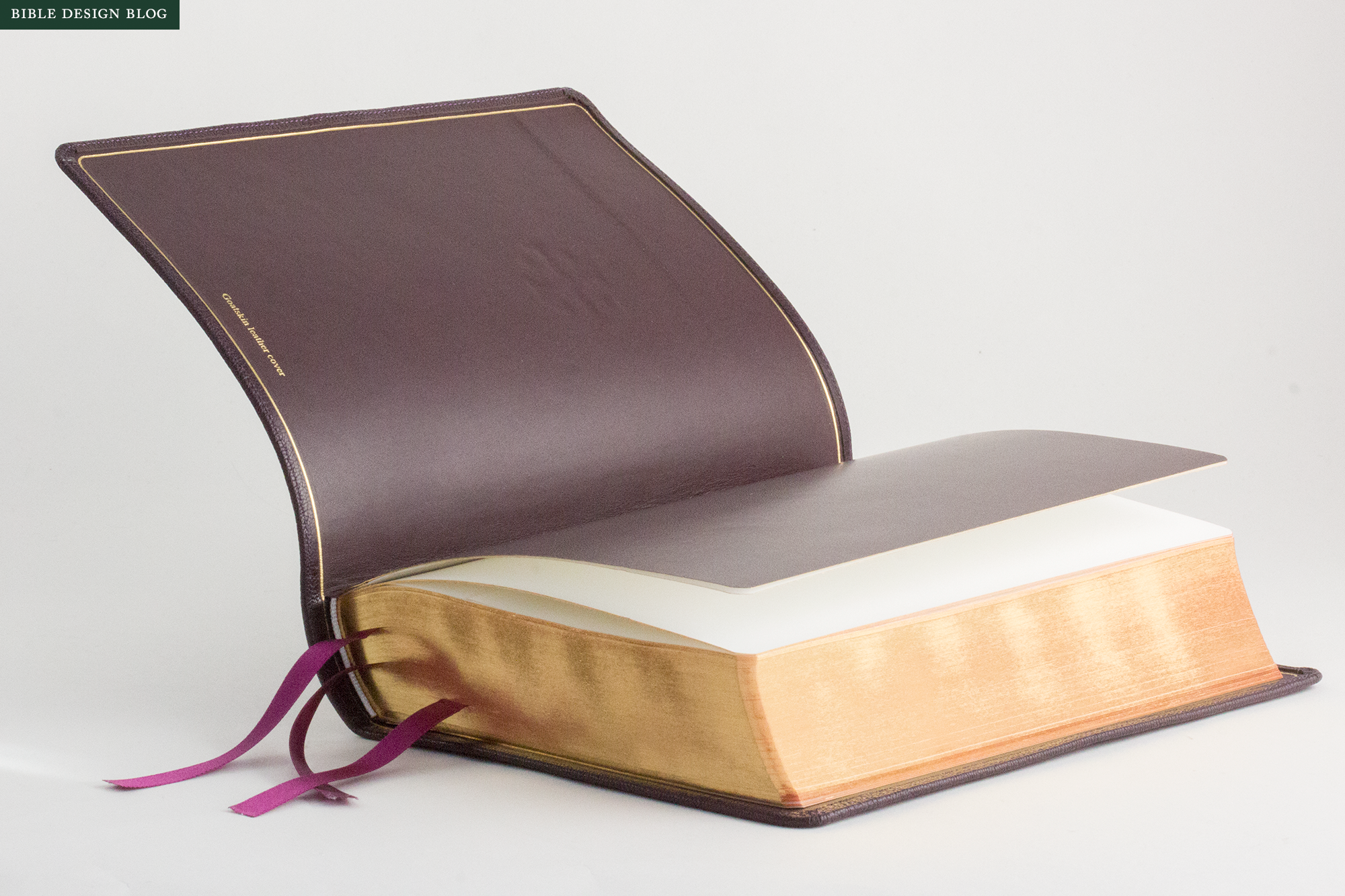
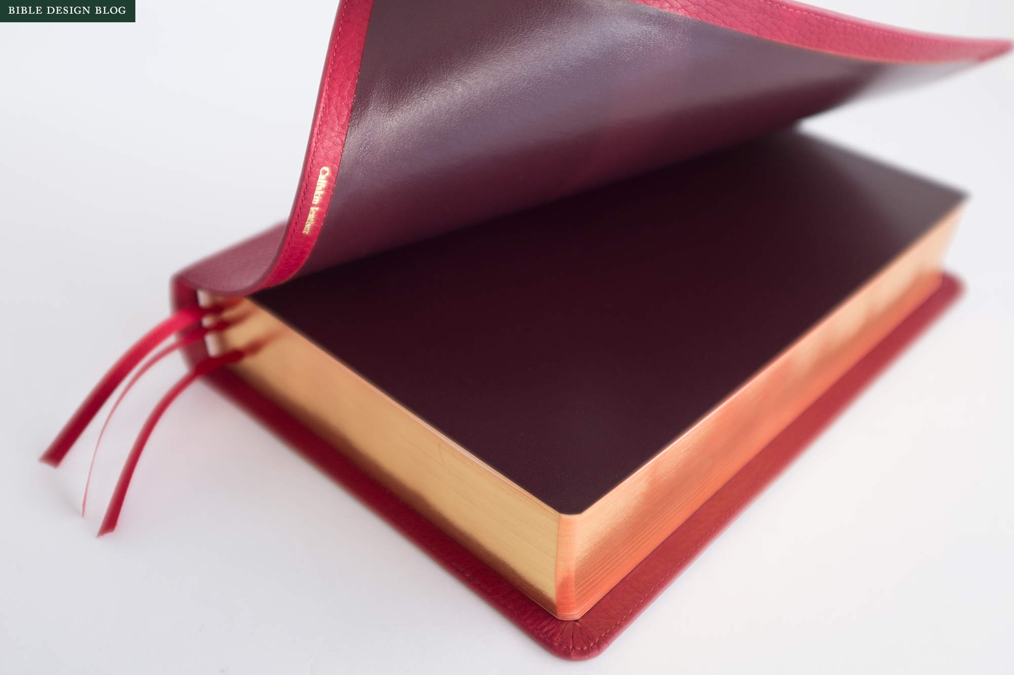
The calfskin bindings for the Canterbury are the more traditional paste-off style, not as limp as the goatskin, but very fine. The covers are soft and thick, with a pleasant tactile grain. While the goatskin bindings list for $210, the calfskin ones are available for $110, which brings the Canterbury into range for a wider number of readers. The calfskin editions do not feel like lower spec Bibles, though. The quality is impeccable, and for those who prefer a firmer cover, they might actually be preferable to the limp goatskin. The Forest Green edition pictured here is already sold out, but the Dark Red and other color options remain available. A leather-over-boards edition of the Canterbury is also in development.

Frankly, the variety of binding options is one of the most exciting things about the Canterbury. I would love to see publishers experiment with short runs bound in interesting, non-standard leathers, and even different styles. I follow several Bible rebinding shops on Instagram, and the sheer variety of hides and styles is staggering. There’s a lot of creativity on display, and yet we have only scratched the surface of what is possible. Publishers should start tapping into this energy more. Crossway has done a bit, and Schuyler is, too. I hope we will start seeing much more variety, even if it is on a limited basis.
A GIFT AND A LEGACY
A few years ago I started getting a certain kind of e-mail I’ve come to think of as the “legacy request.” Usually they come from new fathers, and they ask me to recommend a Bible worthy of being passed down to future generations. They tend to want something traditional, something old fashioned, the kind of thing they might have inherited themselves. Don’t ply me with your usual reader-friendly recommendations: suggest something new that looks like it comes with some heritage, something my children will inevitably revere.

The Canterbury seems tailor made to fill this niche. It doesn’t set out to make the Bible as readable as possible. It doesn’t even try to make the King James Version more accessible, as a single column setting would. Instead, the Canterbury starts with the traditional KJV format and gives it the self-conscious heritage treatment. It pays homage to the past.
As a result, it seems like the perfect answer to the legacy request. It also makes a marvelous gift. If you know someone who loves the King James Version and you’d like to honor that person with a fine gift, the Canterbury would be a lovely choice.