ESV Reader’s Bible, Six-Volume Set Part 3: Paper Performance
This is Part 3 of Bible Design Blog’s look at the ESV Reader’s Bible, Six-Volume Set. This time we take an in-depth look at the paper the books are printed on, testing its resilience with a variety of writing instruments. For an index of the complete series, scroll to the bottom of the post.
If publishing the Bible in six separate volumes is the solution, then what is the problem? In a word: paper. To fit the complete text of Scripture into a single, manageable book, you've got to print on very thin paper. Thin enough that the only common application apart from Bible publishing is rolling cigarettes. Paper this thin suffers from a lack of opacity. Vintage India paper may have been surprisingly opaque for its thickness, but the modern variety seems to have gotten worse and worse. While publishers of quality Bibles struggle to recapture the lost glory, with a multi-volume edition, you can get off the wheel.
Paper Spec
Like The Gospels before it, the ESV Reader's Bible, Six-Volume Set is printed on a specialty paper imported from Sweden, Arctic Paper's 80 gsm Munken Premium Cream. These is a difference, though. Instead of the Premium Cream 17.5 used in The Gospels, this edition uses thinner Premium Cream 13 sheets. This brings the thickness of the page down from 140 to 104 microns, while increasing opacity slightly from 88% to 89%. While the numbers suggest a minor change, it seems rather substantial to me.
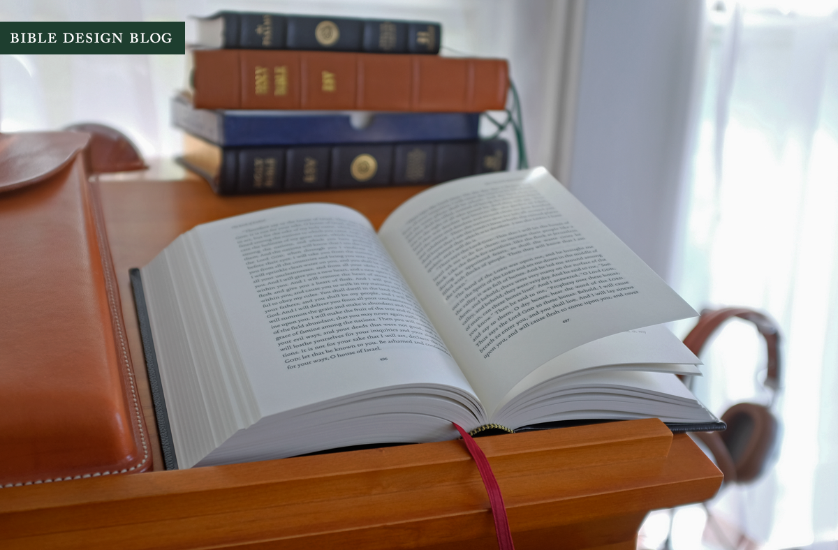
For a glimpse at the way this paper is produced, be sure to watch Crossway's promotional video. There's something about the journey from tree to roll to sheet to page that I find mesmerizing. A lot of care has gone into paper and printing, both in choosing the materials and minding the details of production. Attention to paper grain and the use of cold-setting glue in the binding help the books open flat, which shows off the qualities of the paper.
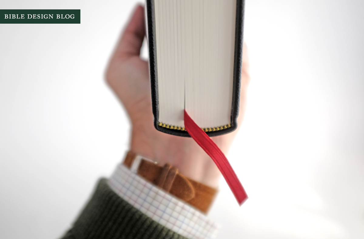
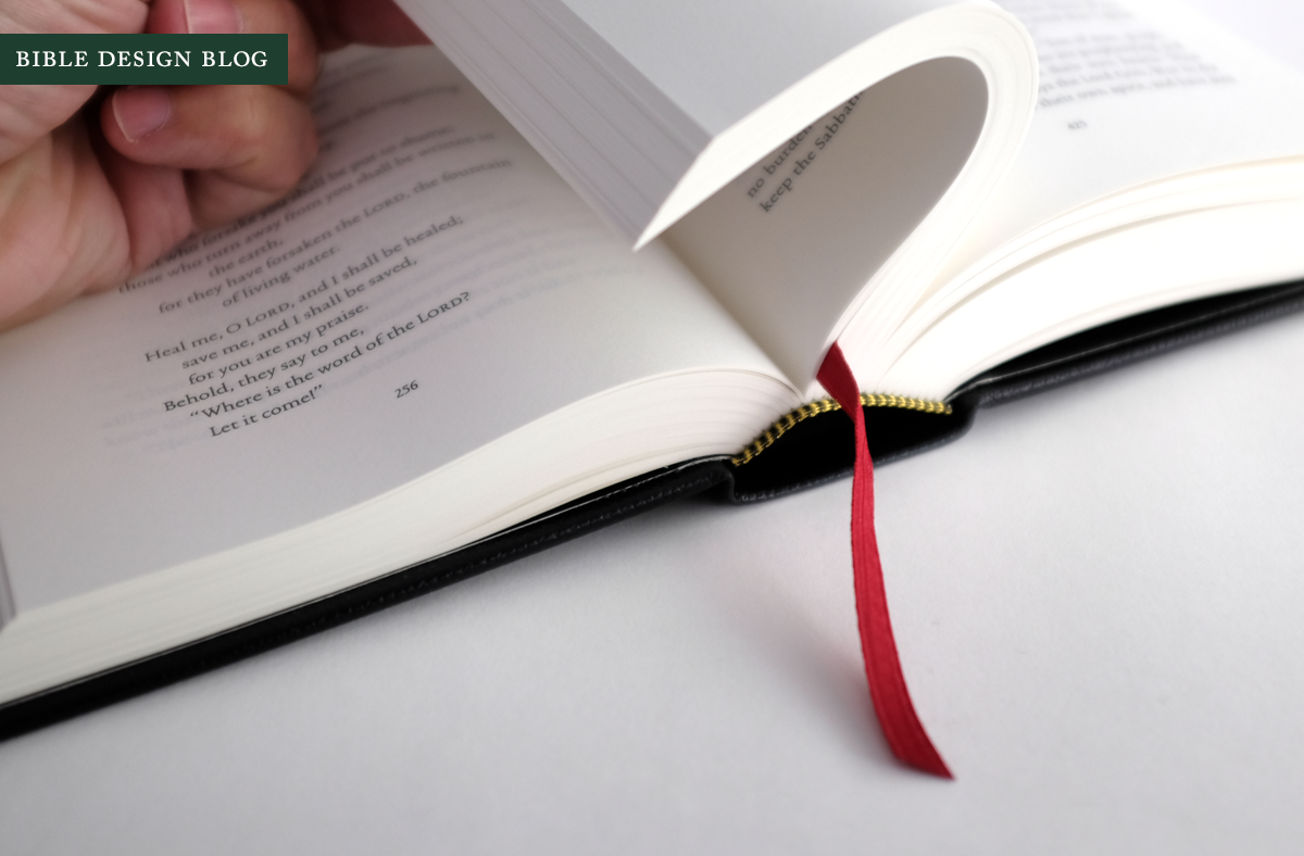
The pages of the Reader's Bible are smooth without feeling slick. The off-white color is easy on the eyes. The show-through -- printing from the back of the page visible through the front -- is comparable to a regular book. You'll see it, but it's never distracting. On this count the Reader's Bible is comparable to books published by Library of America. In fact, I'd rate it higher.
Tearing and creasing
Thin paper can make turning individual pages a challenge. If you've ever tried to find the third epistle of John in a hurry, you know what I mean. Another downside is that, if you don't handle the pages gingerly, they can tear. With practice you develop the ability to flip through a Bible without damaging the tissue-thin paper. Don't let your five-year-old anywhere near it, though.
One of the little experiments I conducted with the Reader's Bible was seeing how easily I could tear the pages. There was nothing scientific here. I rested one hand on the page, then used the other to try and turn it. To tear the 80 gsm sheets did not require a lot of pressure. I did have to be intentional about it, though. While I wouldn't handle the Reader's Bible carelessly, the paper is much more forgiving than the 20-40 gsm paper we're accustomed to in Bibles.
The pages will crease when folded, of course, but I also noticed that if I rolled a single page back on itself, the pressure left a mark down the center.
Writing in the Reader’s Bible
Never say never, but I'll probably never write in my 6-Volume Reader's Bible. No underlining, no highlighting, no handwritten notes scribbled in the margin. Call me unadventurous. I wouldn't walk into a cathedral with spray paint and stencils to touch up the artwork on the walls, either. Somebody's going to do it, though, and that somebody might be you. Fortunately, Crossway sent me some unbound signatures, so I put them to the test with a variety of writing instruments. Let's find out what you can get away with, and what to avoid.

Pencil
I started off conservatively with a couple of pencils. For underlining and writing, I used a freshly sharpened Caran d'Ache Swiss Wood HB, and for highlighting I turned to a Koh-I-Noor dry marker in yellow. The results? Lovely. You can write all day with pencil on this paper, and when you turn the page you won't have any unsightly lines showing through. The markings might fade over time -- they're not that bold to begin with -- but it's a small price to pay.
My fond memories of the day in elementary school when I traded in my last pencil for a proper grown-up pen have resulted in a blind spot where lead is concerned. I forget what a practical tool pencils are, only to rediscover them yet again. Pencil is usually a safe bet on thin Bible paper, too, as long as you don't write with too heavy a hand. It has the advantage of being erasable, too. If I were going to mark up my Reader's Bible, this is route I would take.
Ballpoint
An uncoated paper like this doesn't always play well with my beloved fountain pens. For writing in Bibles, "dry" pens like ballpoints are usually a better bet. As with pencils, you've got to be careful not to press too hard. Master the technique, though, and results aren't bad.
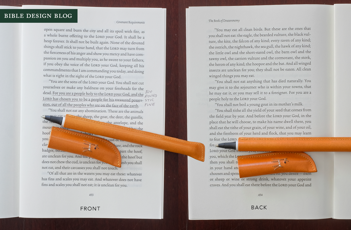
I put a humble Bic pen to the test. This one is marked 'round stic fine,' though to be honest I did not realize there were options. Let's just say I'm not a fan of Bic pens. I only have one, which I keep hidden inside this whimsical leather sheath. The Bic performed well on Munken Premium Cream. I didn't have to press too hard for an even line, and the writing was only faintly perceptible on the reverse of the page.
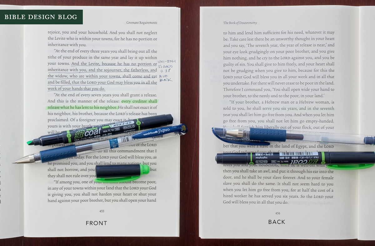
Uni-Ball Signo (0.38) and Tombow Highlighter
One of the perks of spending the summer on the West Coast is that they have a lot more Japanese stationery stores out there than we have on the plains of the Upper Midwest (which isn't saying much). I like the Pilot H-Tec C, but a lot of people rave about the Uni-Ball Signo, and now I know why. The Signo is now my stylo of choice when I can't use a fountain pen, so I decided to test one out on the Reader's Bible, along with a Tombow highlighter.
I figured the pen would be fine -- especially with its precise 0.38 point -- but the highlighter worried me a bit. As it happens, there was no reason to fret. The Tombow did not bleed through at all. The radioactive green line is hardly perceptible on the reverse of the page. I'm not kidding. Unless you hunt for the marking, you will not even notice it's there. Frankly, I am surprised. But not surprised enough to start highlighting the Reader's Bible. Suffice to say, you could if you want.
Fountain pens
Now I was feeling confident, so I lined up a selection of fountain pens. There are so many variables when it comes to these -- the size of the nib, the type of ink -- that such a test is anything but objective. Still, this gives you an idea of how the pens I use most frequently these days perform on the Reader's Bible.

The nib sizes are arranged in ascending order, smallest to largest. Generally speaking, Japanese nibs tend to write a finer line for their rating than Western ones, which means that a Western Fine compares more to a Japanese Medium. So I went from a Japanese Extra-Fine to a Japanese Fine, followed by a Western Extra-Fine and two examples of Western Fines. The pens in question are a Pilot Custom 74 filled with Iroshizuku Tsuki-yo, a Pilot Custom 823 filled with Sailor Epinard, an Edison Herald filled with J. Herbin Gris Nuage, a Kaweco Lilliput filled with J. Herbin Vert Olive, and a Karas Kustoms Fountain K machined from copper filled with Private Reserve Ebony Blue.
As you can see from the photo above, none of the ink bled through the paper. The writing is faintly observable until you get to the Fountain K, and then it becomes just observable. Under a magnifier the lines appear a little feathery, which isn't surprising on uncoated paper. With the Japanese nibs the handwriting in the margin appears sharp. All of the Western nibs made my writing look a bit blobby. If you're not picky, any of these pens produced decent results. I'm picky, though, so if I were going to write with a fountain pen in the Reader's Bible, I would limit myself to the Japanese EF and F nibs. (Which is what I typically do when writing in other books.)
Now let's get a little crazy.
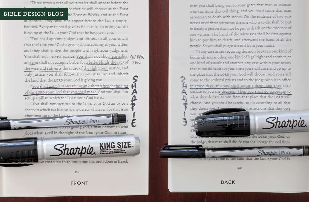
Sharpie
You'd have to be an idiot to write with Sharpie in a book. I did it so you don't have to. First I tried the Sharpie pen -- fine point! -- and then I put the King Size Sharpie to the test. To be fair, the pen's performance was comparable to all the others. The reverse of the page is clean, not a hint of bleed through. Still, this Sharpie pen has been on my desk for going on five years, and writes a little dry by now. I can't guarantee that a fresh one would be safe to use.
What I can guarantee is that using a Sharpie on the Reader's Bible is a dumb idea. The ink bled through significantly, as you might expect. The Sharpie is a great way to check the line-matching in a Bible, which is dead-on in this case. It's a silly way to do anything else. I had to give it a try, though. Hope you understand.
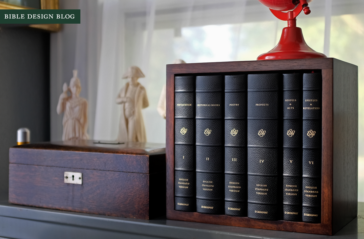
When it comes to choosing paper for the ESV Reader's Bible, Six-Volume Set, Crossway made a fine choice. The opacity and feel of the pages is comparable to other fine press books. There's enough texture for a pleasant touch, and enough weight to the sheet so that turning individual leaves is never a challenge. Both the leather-over-boards set pictured above and the standard cloth-over-boards edition feature the same insides, so whichever you choose, the reading experience is the same.
I've had the pleasure of watching friends -- i.e., test subjects -- react to the Reader's Bible for the first time. They notice the novel-like layout, the absence of apparatus right away. But the fact that the paper is nice, that the print doesn't show through to a distracting extent, that the books fall open naturally in the hand -- none of that registers, because it's all as you'd expect. We only notice when our unconscious expectations are not met. Like good design, quality paper makes itself known by not making itself known.
The ESV Reader's Bible, Six-Volume Set Complete Series
"Reverent Joy": Crossway Launches ReadersBible.org, Releases Video
More to come!