A Clean Slate: New Quentel NKJV Continues A Trend
The latest Schulyer Quentel NKJV continues a trend seen in each successive printing of the popular double-column reference, trimming some bulk by using a thinner paper stock. The question is whether or not the change will sit well with those who crave the old edition’s opacity.
Let me begin by making excuses. Twelve months have passed since my last post. While I gave up a long time ago on the dream of regular updates, embracing a quality-over-quantity philosophy, a year is simply ridiculous. The thing is, prior to my ordination I used to complain about not having enough time. Now I glance back with nostalgia on those lazy days of yore. For those of you who’ve missed my idiosyncratic commentary, please accept my apologies for making you wait so long. Yes, I hope to do better in the future. Rather than making promises, though, let me just commit to doing what I can do.
The last you heard from me, in June 2018, the occasion was Schuyler’s release of a Thinline Quentel. Consider this a further installment in the same saga. No, the 2019 Quentel NKJV is not a Thinline — it is a new printing of the classic Quentel without any features dropped in the interests of slimness. But it shares the same paper spec. If you were eager for a full-size Quentel that weighs less and drops some girth, this will be a pleasant development. There are some trade-offs, however. And they may not be what you’d expect.
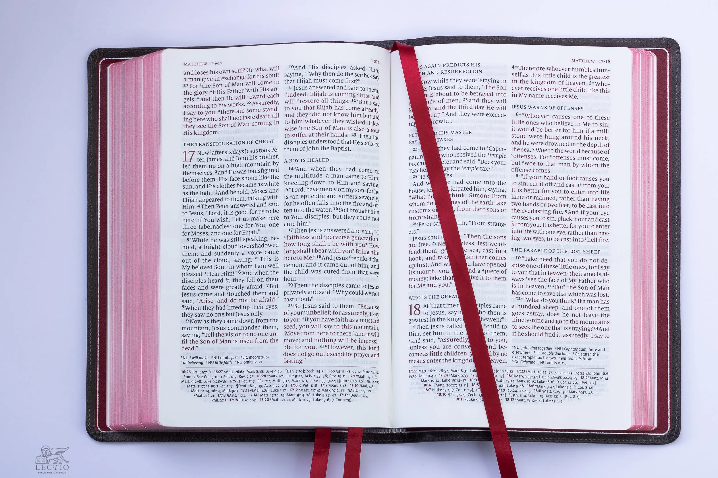
Above: The 11 pt. font size makes this classic double-column reference an enjoyable read. On a table, stand, or pulpit, it opens flat. The limp cover can be folded back to make hand-held reading a bit easier.
The 2019 Quentel NKJV features improved red-letter print and a thinner paper spec. Compared to the previous version’s 36 GSM paper, the new edition’s 28 GSM sheet—the same spec in use with Schuyler’s Personal Size Quentel line—reduces the bulk considerably. The 2016 Quentel NKJV weighed in at just under 3 lb., while the 2019 trims 8 oz. off that measurement, coming in at about 2.5 lb. At the spine, the 2016 measured 1.75” thick, whereas the new edition is a comparatively svelte 1.5”. Make no mistake: this is still a hefty, full-size Bible. But the 2019 Quentel NKJV includes every feature of its predecessor page-for-page, only this time you get everything in a trimmer, lighter package.
The question, of course, is whether these reductions come at the expense of opacity. Flip through a nice vintage Bible and you’ll discover that the India paper of old combined thinness with exceptional opacity. Modern paper doesn’t really compare. When the Quentel was first introduced, one of the hallmarks was its 45 GSM paper, which gave the book exceptional heft. Why tote around such a brick? In hope that if the pages were twice as thick as other Bibles, they would be twice as opaque, too. Unfortunately, it doesn’t work that way. Bulk increases at a much higher rate than opacity. Ever since, successive Quentels have made been working their way down the scale, from 45 GSM down to 36, and now to 28.


Above: The brown goatskin 2016 Quentel NKJV (bottom) is a quarter inch thicker and a half pound heavier than the 2019 printing (top).
Side by side, the biggest different to my eye between the 2019 and the 2016 is not the opacity of the page, but its color tint. The 36 GSM sheet from 2016 has a touch of the sepia in comparison, while the 28 GSM boasts a brighter white. I don’t want to overstate the difference, because it is fairly subtle. But the newer edition looks a bit more crisp.
On the other hand, the thicker page handles a bit better. There is less crinkle when thumbing through the pages. In fact, this is probably the biggest drawback, despite what you might think. Once you’re accustomed to the thicker pages, 28 GSM Indopaque can seem a bit like tissue. The pages feel slightly more delicate, and while it isn’t a huge difference, you can certainly tell if you’re trying.
The nice thing about comparing two identical editions is that you can turn to the same page in each and compare the exact same text to judge differences in opacity. The less translucent the paper, the more legible the print. Personally, I’m glad to accept the extra bulk if the end result is a noticeable gain in opacity. In this case, it really isn’t. The 36 GSM looks superior to me, but not by much. If we still lived in the era of brick-and-mortar retailing, I cannot imagine anyone grabbing these two volumes off the shelf for a comparison and deciding that the thicker, heavier one is the better option. Sadly, the 36 GSM sheet does not deliver enough of an opacity boost to justify the trade-offs.
Above: For comparison purposes, the 2019 Quentel NKJV printed on 28 GSM Indopaque is on the left, while the 2016 printed on 36 GSM paper is on the right. The difference in opacity appears marginal to my eye, though there is an advantage to the thicker sheet when it comes to handling the pages. I shot this outdoors in shade, and didn’t color correct, so it’s fairly representative of what you see in actuality.
The new Quentel also features improved red-letter printing where applicable. While I am no fan of theological assumptions implied by red-letter Bibles, if you are going to print one, you might as well make the print as legible as possible. This bolder, darker print is both more elegant and easier on the eye than older red-letter editions tend to be.

Above: 2/K Denmark designed the Quentel layout. They can do pretty much anything they set their minds to, including making a double column, red-letter setting I don’t hate.
When Schuyler offered to send a review copy, I asked for a binding color that I have not seen before. They sent this mottled goatskin binding the marketing copy refers to as “slate.” It’s a bit of a shapeshifting chameleon, to be honest. In some light, the leather looks gray, while in others in resembles a weathered brown sofa that’s been in the sun so long most of the pigment has dried out. There may be just a hint of a plum undertone. Then again, maybe not. Holding it in my hand, turning it this way and that, I start to feel like the guy at the coffee cupping session who’s been told to come up with tasting notes. Suffice to say, slate is … interesting, complicated.
What makes it a win, for me, though, is the way this color has been complemented by the red-under-silver gilding on the page edges, and the scarlet liners and ribbons. Several years ago, I suggested that publishers break out of the standard red-under-gold box, beautiful as it is, and experiment with other traditional and not-so-traditional options. That triggered some die-hards to complain that I needed the kind of slapping St. Nicholas gave to Arius. (My wife concurs, though for different reasons.)
Above: Depending on the light, the slate goatskin can read as various gradations of mottled gray, or even brown. The red-under-silver gilding is similarly malleable, metallic silver at some angles and red-to-pink in others. Pro tip: Never leave a leather binding on top of a 1970s receiver any longer than you have to for the photo.
Well, I hope the photos illustrate what I was talking about. Not every experiment has been this successful (looking at you, blue-under-silver) but I cannot get over how subtly correct this combination is. And kudos to Schuyler for giving us the most perfect red leather lining, and sticking with matching red ribbons. This combination might work with any cover, but it goes especially well with the cool tone of the slate.


One of these days, I hope to open my mail and find a new Bible printed on 5 GSM paper with 100% opacity, though I suppose it will have to come with nanoscopic finger extenders to allow for turning the pages. Unfortunately, despite all our technology, we have lost the art of India paper. Maybe someone’s working on the problem. If so, I would love to hear about it. In the meantime, the easiest solution to the opacity problem is to divide the Bible into multiple volumes, as some reader’s editions have done. And for single volume Bibles, we have to weigh the trade-offs and look for a paper that delivers reasonable opacity without tipping the scale. For me, the Quentel trajectory seems to speak for the market as a whole: we can live with a certain degree of ghosting—the five o’clock shadow that peeks through from the other side of the page—if it saves some weight.
You can purchase the 2019 Schuyer Quentel NKJV from EvangelicalBible.com by following this link. As of publication date, the list price for editions bound in goatskin was $190. There are also calfskin editions available in black and navy, with a current list price of $110.