Interview with Bibliotheca's Adam Lewis Greene: Part 1

Bibliotheca is taking Kickstarter by storm. Adam Lewis Greene's four volume edition of the Bible hit its $37,000 funding goal in just over twenty-four hours, and has now blown past the $100,000 mark with weeks to go. More than a thousand backers have gotten behind the project, which is being talked about all over the Internet. I mentioned the project over the weekend, and now I'm happy to bring you the first part of my interview with Adam Lewis Greene.
J. MARK BERTRAND: I backed the project before I even watched the Bibliotheca video, and when I did watch it, I was blown away. So much is packed into those seven minutes! You’ve distilled the argument for reader-friendly Bibles so elegantly that it’s clear you’ve put a lot of thought into the subject. How long have you been planning Bibliotheca? Did the idea emerge fully formed, or did you refine it over time?
ADAM LEWIS GREENE: I want to start by saying that it was my two very close friends, Daniel and Joseph of Good. Honest., who deserve credit for crafting the content of the project into to a concise message via video. They are true story tellers. If it was left to me, it would be a scattered, technical mess, filled with typographic jargon (much like the rest of this interview will likely be). They know me well, and they took the time to understand the project and my passion for it, and then offered up the beating heart of it for everyone to see.
To answer your question, I have had some form of this idea in mind for about four years now, although the seed was planted more than a decade ago. I remember, as a teenager, reading through the books of Samuel and, upon finishing, thinking to myself, “This story is as invigorating as any story I’ve ever read, seen, or heard.” What is strange to me now is how surprising a revelation that was. Having grown up with the literature, why didn’t I already think of it as engaging?
Years later, when this idea first came upon me it was fairly similar in my mind to what you see now. But I wrestled with it a great deal, changing and molding it into several expressions, before coming full circle. I am glad it went through that process, because even though it is close to what I conceived in the first place, it is much more nuanced and layered than what I could have done before exploring the possibilities.
JMB: Where did your passion for Bible design come from?
ALG: In my independent reading of biblical scholarship, I have been deeply affected by the work of Robert Alter, N.T. Wright and Kenneth Bailey, among others. Their work has shown me the power and intention of the Bible as literary art, intended to be read and enjoyed. On the other hand, I have spent the last half-decade of my professional life developing as a book designer and typographer, reading and applying the masters of those disciplines—Eric Gill, Jan Tschichold, Hans Mardersteig, Gerrit Noordzij, Robert Bringhurst, etc.
It was only a short time before those two threads—biblical studies & book design—converged and became inseparably intertwined.
And then I found your blog, and, well, you know… that was that.
JMB: The factor that “solves” a lot of the traditional challenges with Bible publishing—the tiny text, the thin, translucent paper—is dividing the text into multiple volumes. The Nonesuch Bible, for example, contains three, and Bibliotheca will have four. Whenever I’ve floated the idea in the past, it’s been met with resistance: I’m told people don’t want the Bible in several parts. But the success of Bibliotheca contradicts that. Why do you think there’s a sudden openness to a multi-volume Bible? Is it a question of reaching a different kind of reader?
ALG: I am not sure whether this is a different kind of reader or not. Obviously, the economy and practicality of a single volume is appealing, but there is also an idea out there that the biblical library belongs together in one volume, because “that’s the way it has always been, and was always meant to be.” Understandably—and this included me until I became really nerdy about bible design—a lot of people who read and appreciate the biblical literature don’t know much about the history of its physical form. Why would they? The format of the Bible as it has been given to us for generations took shape in the post-enlightenment world of empiricism, often more concerned about demonstrable facts than the enjoyment of beauty. Now, I believe (or hope), we are coming out of that, to a more balanced place. We have to remember, for more than a thousand years the people who most revered this literature would never have thought to combine it into one volume, or read it as a single book, or strew it about with numbers. These stories were unified, not by being bound into a single volume, but by the culture, belief, and hopes of a people. Once we are exposed to this little bit of history, I think it becomes somewhat easy to take the step of separating the text.
Another factor might be that the ubiquitously encyclopedic format of the Bible has alienated many people over the years, to the point that they don’t actually have any expectations of what a bible should look like, or how many volumes it should be. It could be that it’s not the resistant group of people changing their minds, but an entirely new group of people showing interest.
Truthfully, though, it is hard to say exactly what has happened here, but I know that from the time I started sharing the idea it was met by some with great interest, and by others, not so much. Whatever the case, the conditions are clearly right for something like this. Even the fact that I thought it needed to be done (and I know I'm not the only one) is a reflection of where we stand as a culture in relation to this literature.
To be very clear, I am not offering up Bibliotheca as a replacement of the study-driven formatting of bibles, but as an alternative reading experience.
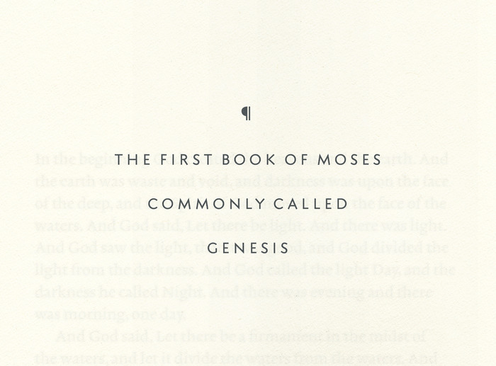
JMB: You’ve developed a beautiful serif typeface for the text, and a san serif for titles that I love about as much as Wes Anderson loves Futura. The logic of most Bible fonts these days seems to be packing more words onto the line legibly, but you’ve gone in a different direction. Can you tell me a little bit about the process of designing the fonts?
ALG: Before I go on about this, I would like to warn the reader that asking me about type is a Pandora’s box. So, for those of you who are not interested in typefaces, I recommend skipping ahead.
But the quick answer to that question: A main goal of this project was/is to achieve an extremely readable experience through extravagantly optimized typography. I decided early on that I would cut absolutely no corners. If you want to fit the text into one manageably sized single-column volume, you’re likely going to have to push the limit of characters on each line. This is not my idea of “sparing no expense.” I’ll leave out all the math here, but I think Gill explains it most simply: his ideal is about ten to twelve words per line, and no more than fifteen. His Essay on Typography, both in content and in form, is my favorite reading on the topic of line-length and text alignment.
As I mention in the video, designing an original typeface came out of a desire to imitate the ancient Hebrew scribal tradition, in which a “set apart” script is used exclusively for sacred writings.
Backing up a step: At the top of the food-chain in type design right now, in my opinion, is Gerrit Noordzij. He happens to be very passionate about biblical literature himself, and has even mentioned that we need to stop packing it into one volume. Coincidentally, his major contribution to the discipline of type design—and, for that matter, legibility—has been his reversion to hand-writing as a basis for legible type. He would say that the history of type is the history of idealized hand-writing.
Inspired by the Hebrew scribal tradition, and equipped with the theories of Noordzij, I undertook the task of learning how to write, with a broad-nibbed pen, the traditional forms upon which most book typefaces are still based. Of course this was a slow process, but I was determined to understand firsthand how writing informs type. It has been very rewarding as a type designer.
I know you are familiar with the work of Hans “Giovanni” Marderstieg and Bram de Does. Both are in roughly the same theoretical camp as Noordzij. I am an avid admirer of their work, and—because I am young in the discipline of type design and probably not yet capable of anything truly original—I have to say that my typeface is probably little more than an amalgamation of Marderstieg’s strikingly beautiful Zino and de Does’ strong yet elegant Lexicon. Add a pinch of Eric Gill and there you have it. I am a little embarrassed to mention these names, as my work certainly pales to all of theirs, but I have to give them credit.
Also, something that is easy to forget about type is that it is not only black, but also white that needs designing. You are not only shaping letters, but also the spaces between them, which are equally important in achieving rhythm and legibility. These three—Noordzij, de Does, and Mardersteig—all display a masterful grasp of this balance, and that is why I have adopted various aspects of their approaches.
That said, working with my own typeface has been ideal because I am able to optimize it precisely for the size at which it will be set, the measure of the column, the amount of leading between lines, etc.
As for the sans serif typeface: I am glad I finished the capital alphabet before launching the campaign (I wasn’t sure if I would), and I am thrilled it has a fan in you, Mark! I have always loved Futura, one of the few great sans serif typefaces with genuinely classical proportions, but I also enjoy the natural terminals (angled ends of the strokes) in Kabel and the more humanistic tendencies of Gill Sans. So, I just did what I like, using the the essential forms of my book typeface as a basis. I’m proud of the result.
As a note: Since I was not yet finished with my typeface for the film shoot, the prototype in the video features the very excellent Scala Sans on the gold-lettered spines, but that will be replaced with my sans serif for the actual edition. Didn’t want there to be any confusion there.
That's the end of Part 1. Tomorrow I'll post the second part of our interview, in which I ask about layout, editing the ASV, and the impact the funding campaign's success may have on the future of Bibliotheca.