Blue Like Jazz
If you read through the archives -- and I strongly recommend it -- you'll see clearly my bias when it comes to color. Black is the standard where Bibles are concerned, but I've tried to make the case for both brown and red as sensible alternatives, while looking down my nose at most shades of burgundy. Color is a purely aesthetic issue, though I suppose a case can be made for anything non-black as making for a less intimidating impression on others. Who's ever heard of a "big, British Tan attack Bible" after all? As crazy as my advocacy of brown and red might seem, I've never tried to drum up support for ... blue. Not that I haven't been tempted. Remember Cristian Franco's blue Spanish NT? That caught my fancy. And so did the 1961 NEB New Testament I in blue morocco I posted around the same time. Now, a couple of vintage Cambridges have come along that really push the blue boundaries. Let's take a look:
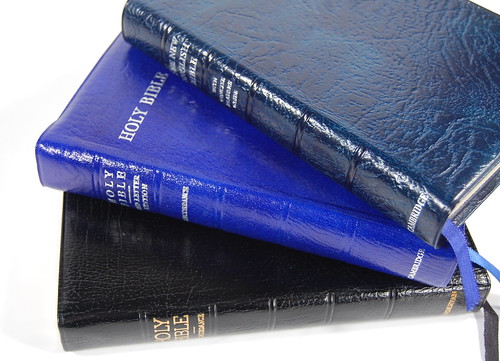
They're pictured above with the Zondervan KJV I wrote about last week. I'll tell you all about them, but first a couple more group photos.
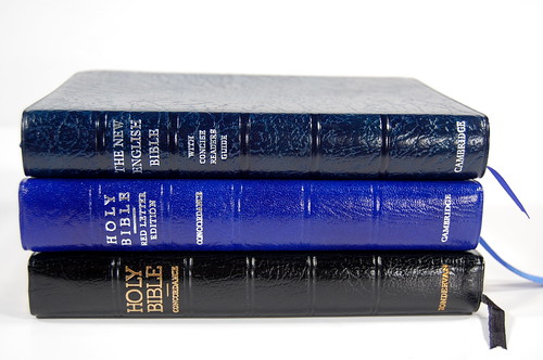
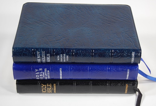
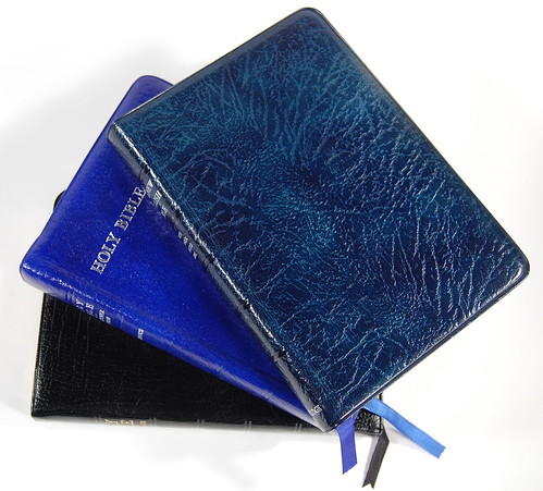
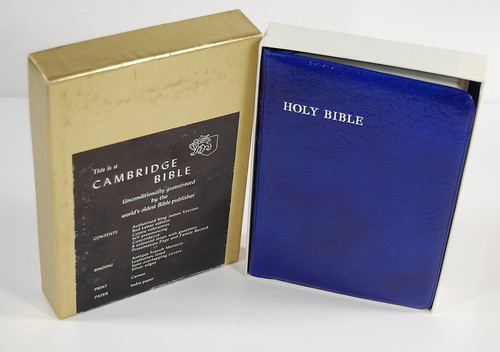
Look at the grain on the top Bible. Look familiar? It reminds me of the Allan's Brevier Clarendon I reviewed in April. They're both water buffalo grained calfskin. The vintage Cambridge is the 56X, a black-letter Cameo edition of the New English Bible with a typesetting dated 1972. It includes a Concise Reader's Guide and the calf cover is lined in something called Leathertex. They called that color "ultramarine," in case you're wondering. Here it is in the gold box:
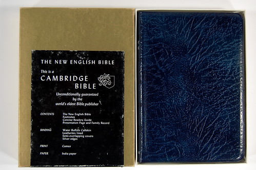
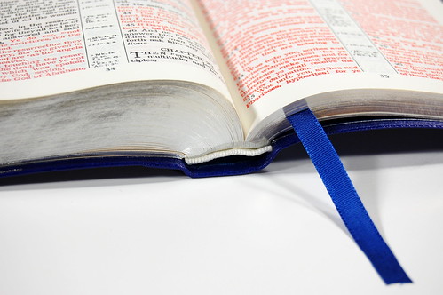
Notice the variation in the color? It's a beautiful, mottled effect, perhaps a bit subtler in life than it appears in the photos. A bit wilder than basic black, I admit, but I find it quite elegant. As the photo below demonstrates, the Leathertex lining is a darker solid. There's a single mid-blue ribbon and silver gilt pages. The cover is stamped WATER BUFFALO CALFSKIN on the inside front.
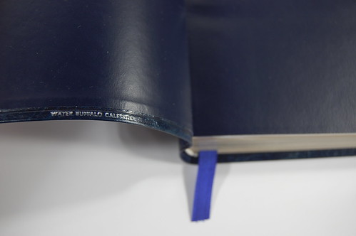
Like the Allan's water buffalo calf, this one is thin and crisp -- not stiff, because it's perfectly flexible, but not what I'd call limp, either. I usually describe a cover like this as "structured," for lack of a better term, because it makes me think of sharply cut military-style suit jackets, as opposed to the soft, unstructured, round-shouldered variety (the sartorial equivalent of today's limp, matte calf). If you appreciate flexibility on the one hand, but don't want a Bible with liquid limpidity, this is the kind to look for.
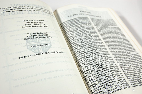
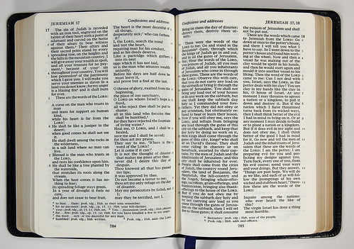
Declining paper quality is one of today's perennial gripes, so it's interesting to see how the vintage stuff compares. As you can see from the photos above, Cambridge India paper does manifest what I call "ghosting" (and many call "bleedthrough" -- though I tend to think of the latter as what happens when you write on the page). At the same time, as the photo of the spread demonstrates, it's neither as pronounced or as distracting as it often is in contemporary editions. I don't have the expertise to speak intelligently about paper quality. "When has that stopped you before?" you're thinking. Point well taken.
Suffice it to say, my design theory is simple: any time Bible designers make decisions on behalf of the whole edition (cheaper paper to keep costs down, smaller type to keep book width reasonable) that compromise the integrity of the individual spread (too much ghosting, hard-to-read type) the net result is a Bad Thing. Good design should privilege the spread, because that's what the reader experiences at any given moment. I'd rather put up with higher costs and less svelte editions than compromise the reading experience. This edition suggests that not too long ago, my position was tenable.
One last glimpse of the NEB and we'll move on:
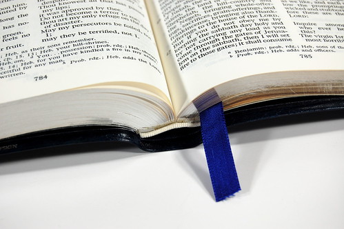
Now, let's have a look at the second Bible, another Cameo. This time it's the 74XRL, a red-letter KJV bound in antique French Morocco. The color, my friends, is "marbled indigo." BibleDesignBlog.com is not responsible for any retinal damage that might result from prolonged exposure.
Okay, so maybe I exaggerate the brightness of the color a little. The specs on this one are the same as the first -- Leathertex lining, single ribbon, silver gilt. They both measure 5 1/4 x 7 3/8 x 1", though to my eye the NEB looks a high slimmer than the KJV. The KJV's ribbon is about an inch longer, and unlike the NEB it's stamped on the front cover (albeit off the left in that wonderful, asymmetrical vintage Cambridge way). Both have "semi-overlapping" edges.
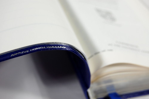
The title page isn't dated, so I'm not sure of the publication date, but I'm guessing the two are roughly contemporary. The KJV didn't have the guarantee card in the box, so I can't compare them. As you can see, there is some color variation in the indigo -- hence the "marbled" -- although the predominant shade is much lighter than in the ultramarine. I don't know how antique French Morocco differs from the normal variety, but I will say that once again, vintage morocco is a different animal than the current crop. A Cambridge Bible in French Morocco up until a few years ago would have thin, flexible covers -- in fact, it was invariably limper than the hit-or-miss calfskin, which could be quite stiff or quite supple, depending on the one particular copy you happened to get. Now, though, Cambridge morocco seems like a stiffer proposition. I'm not sure what's changed, but something has.
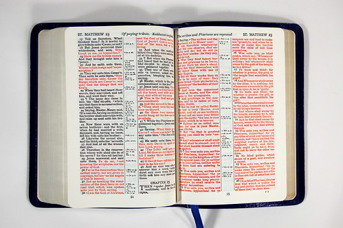
Did I mention the red letters? They're not deep red, dark red, or even burgundy. They're bright. They jump off the page in a big way. The layout is the classic Cameo, about as readable as the old school gets and a beautiful compromise in terms of size, features and legibility. I prefer the NEB's design, but there's no denying this layout is a classic.
I wish we saw more use of silver as a gilding option. Gold is fine and art-gilt (the traditional "red under gold") is beautiful, but there's something to be said for silver as a muted, elegant alternative. With a blue cover, I can't see any other option, but I find it equally appealing with black, brown and red.
Now for the real question: would I actually use a blue Bible in everyday life? The ultramarine above -- most definitely. The more I read it, the more convinced I am it's one of the most beautiful copies on my shelf. The marbled indigo? Not so much. I appreciate the quality and find the color beautiful, but it's not understated enough for my tastes. While it doesn't panic me as much as the famous turquoise cover I've mentioned before, it's right up there. If I were having a Bible rebound in blue, I'd go for something darker.
Once again, though, I'm awed by the variety that once existed in the marketplace and the level of quality that went along with it. Today, these Bibles might be considered luxury items, but French Morocco was actually more of an economy option. It's just that, even with economy, there was a commitment to quality that made certain compromises unthinkable. I don't want to romanticize the past or anything. But I'd love to see more publishers and designers looking back to the tradition for future inspiration.